CLIMATE INDICATORS FOR PALAU
These example product sets are generated through a series of jupyter notebooks. For more details, click on the linked notebooks in the indicator column.
| Variable | Indicator | Indicator Type | Historical | Projections |
|---|---|---|---|---|
| Atmosphere | 1. Greenhouse Gases | 1.1.1 Atmospheric CO2 |
Figure 1 Monthly Mean Concentration of Atmospheric CO2 at Mauna Loa since 1959.
The blue line represents the monthly mean values, centered in the middle of each month.
The red line represents the same, after correction for the average seasonal cycle.
The solid black line represents the trend, which is statistically significant (p < 0.05).
The annual oscillations at Mauna Loa are due to the seasonal imbalance between the photosynthesis
and respiration of plants on land. From NOAA ESRL Global Monitoring Division.
https://www.esrl.noaa.gov/gmd/ccgg/trends/
|

|
| 2. Air Temperature | 1.1.1 Mean Surface Temperature |
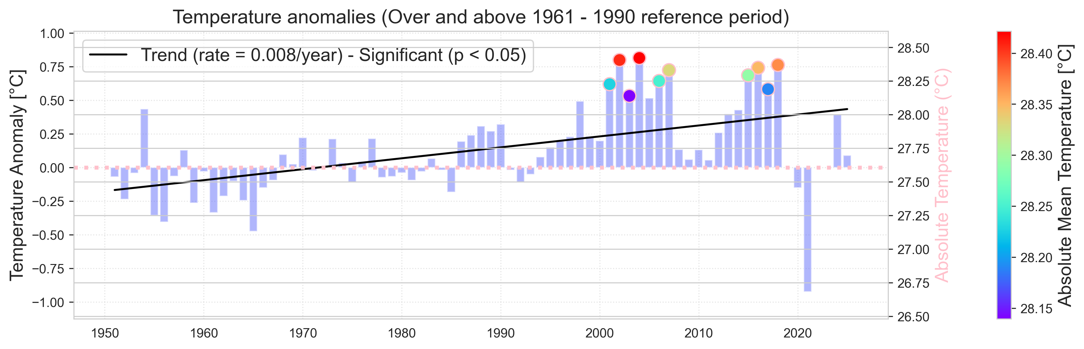
Figure 2 Annual mean temperature anomalies relative to 1961:1990 climatology at Koror.
The colored dots represent the 10 warmest years on record, with the absolute values shown along the right axis.
The solid black line represents the trend, which is statistically significant (p < 0.05).
|
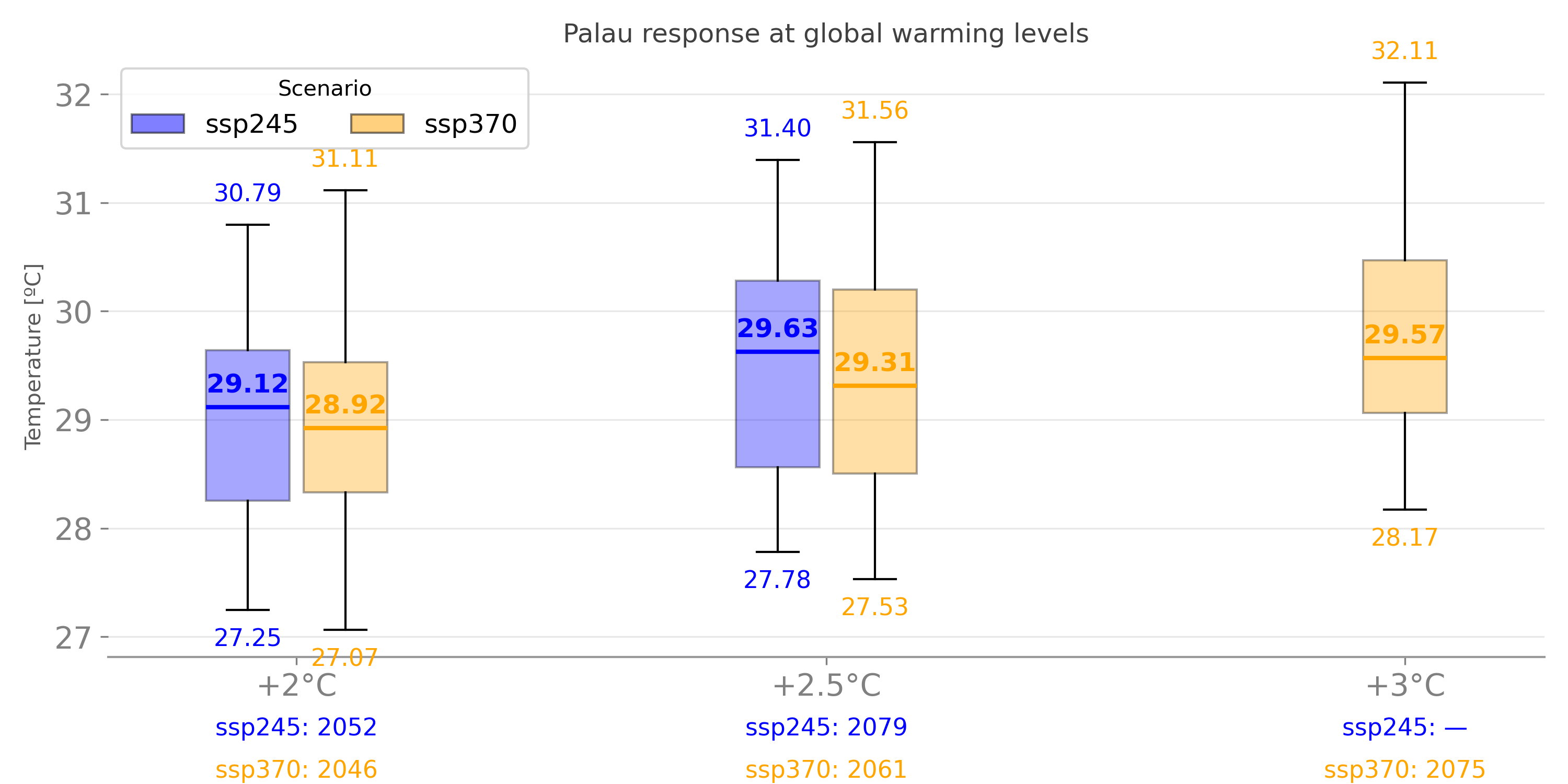
Figure. Mean air temperature projections at global scenarios.
|
1.1.1 Maximum and minimum temperature |
Figure Annual maximum (red) and minimum (blue) temperature at Koror.
The solid black line represents a trend that is statistically significant (p < 0.05).
The dashed black line represents a trend that is not statistically significant.
|
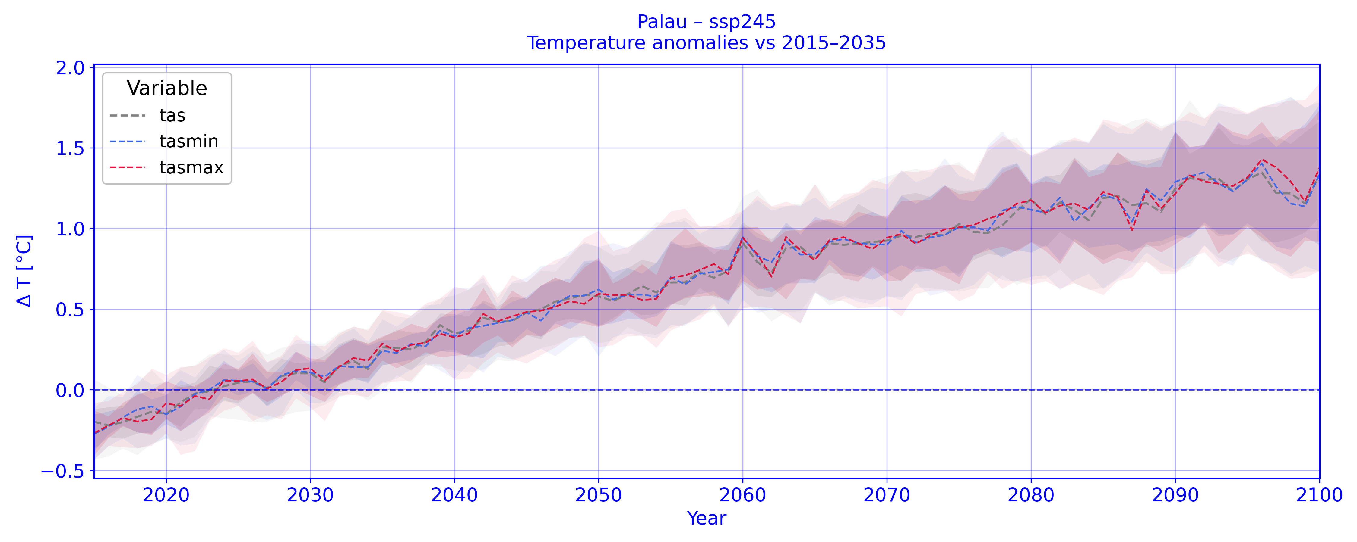
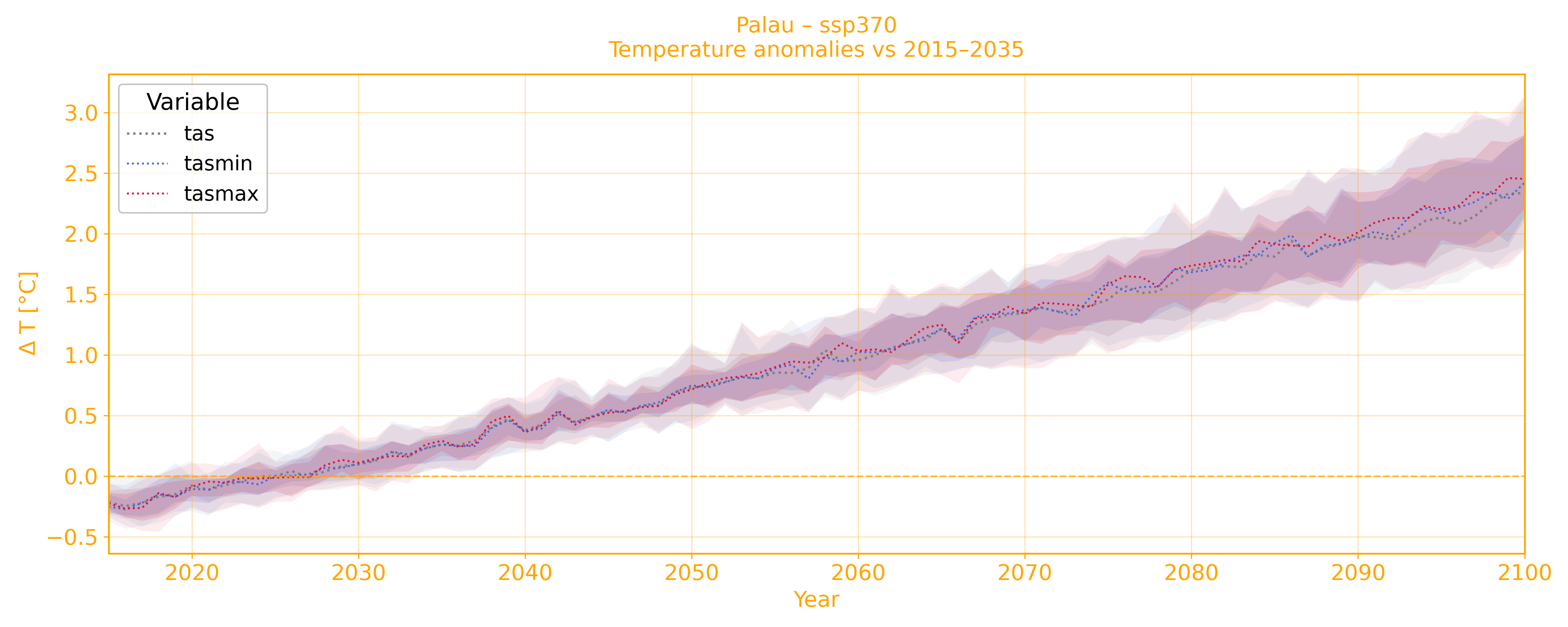
Figure. Minimum and maximum air temperature projections at ssp245 and ssp370 scenarios.
|
1.1.1 Amount of Hot Days and Cold Nights |
Figure 4 Annual Number of hot days and cold nights at Koror. Hot days are defined as days above the 90th percentile
for that same calendar day (e.g., January 15th) from the 1960–1990 period, while cold nights are defined as days below the
10th percentile for that same calendar day in the 1960–1990 period. The solid black lines represent statistically significant
trends (p < 0.05).
|
 ç ç
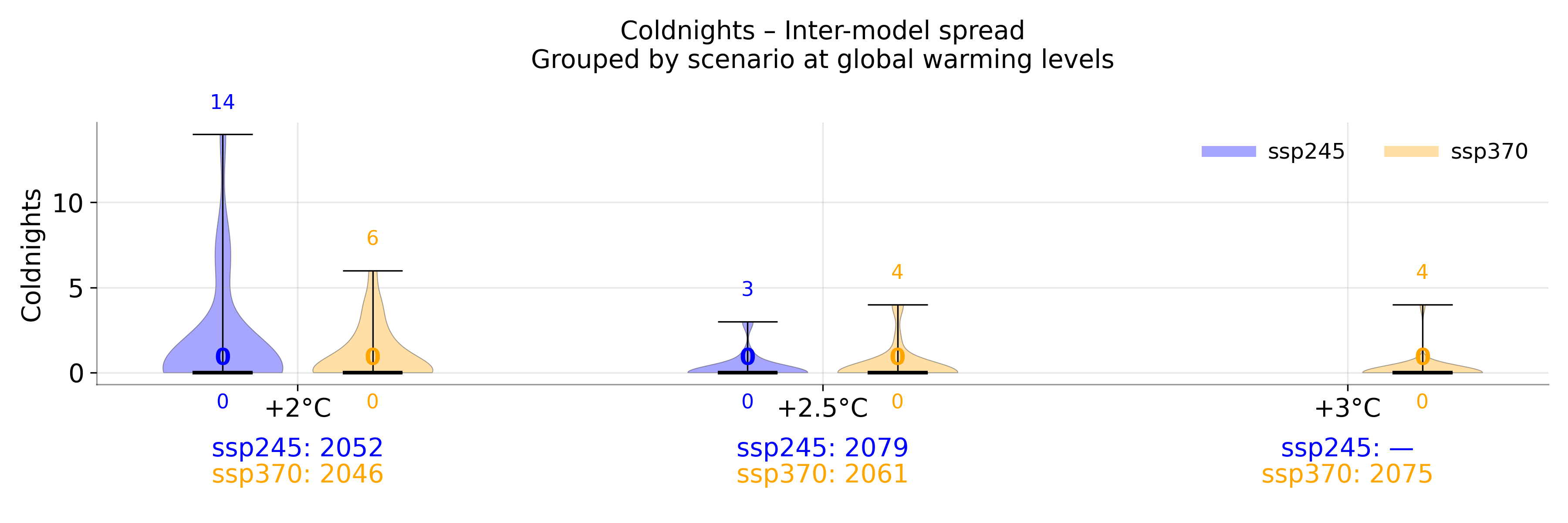
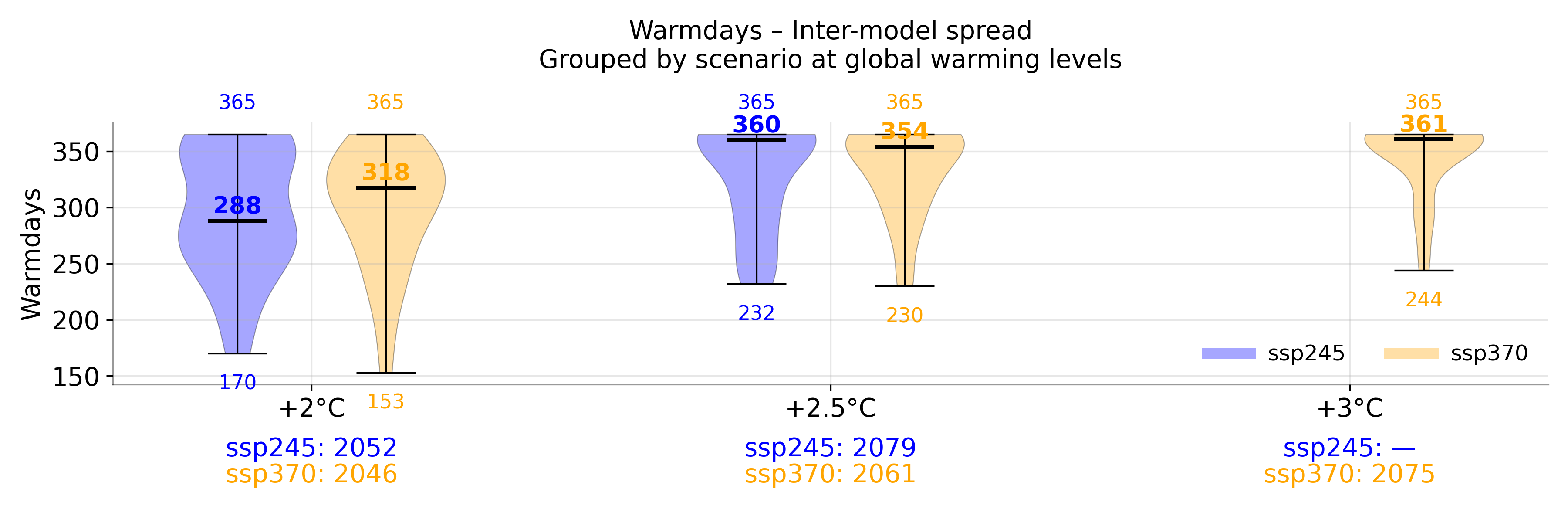
Figure. Warm days and cold nights at global scenarios.
|
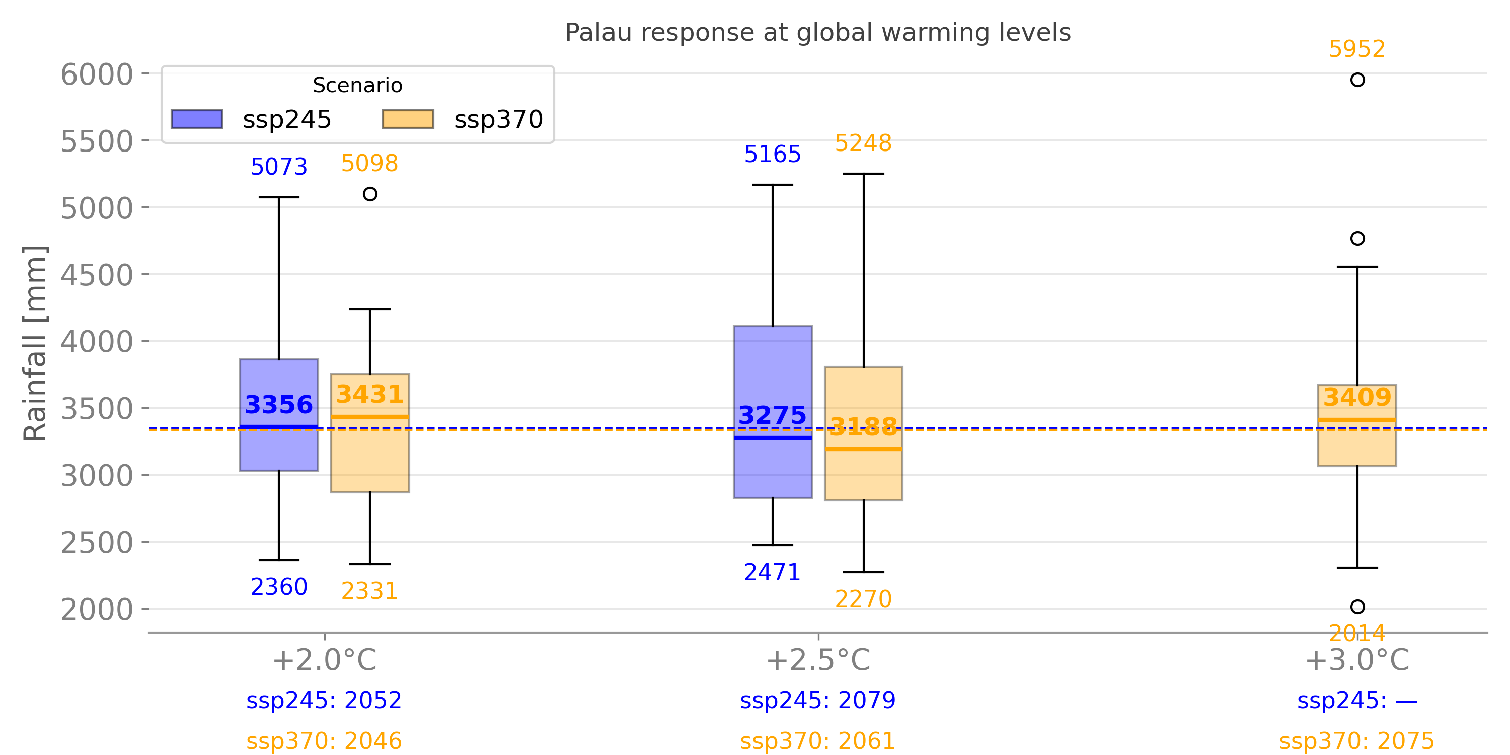
| 3. Rainfall | 3.1 Total wet day rainfall |
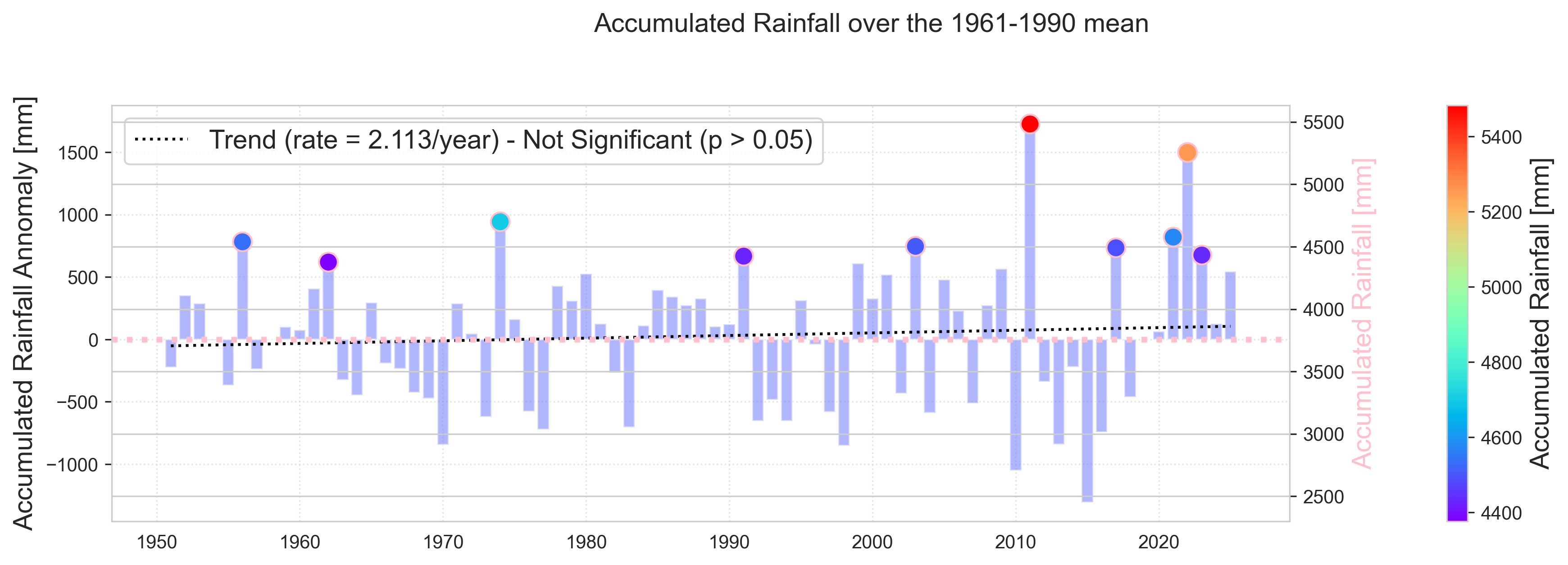
Figure 5 Annual total rainfall anomalies relative to 1961–1990 climatology at Koror. Units are mm/year.
The colored dots represent the 10 warmest years on record, with the absolute values shown along the right axis.
The dashed black line represents a trend that is not statistically significant.
|
 ç ç
Figure. Accumulated rainfall
|
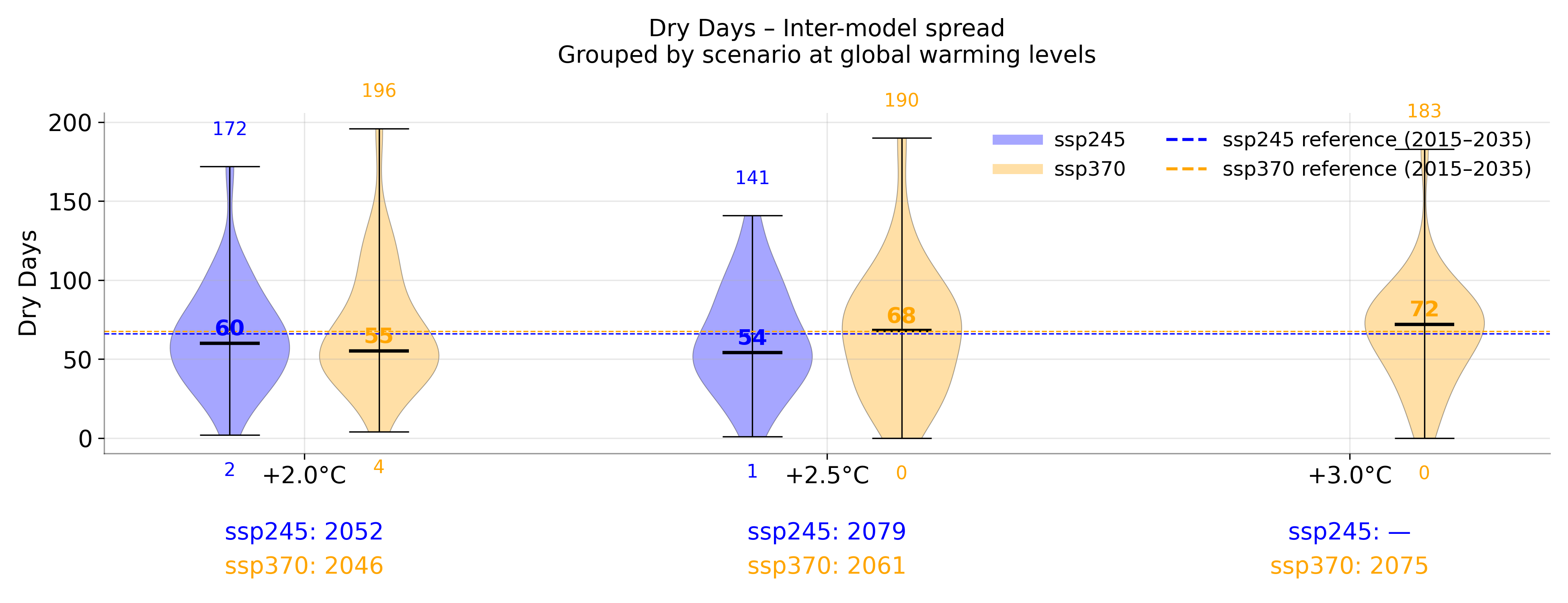
3.2. Dry Conditions |
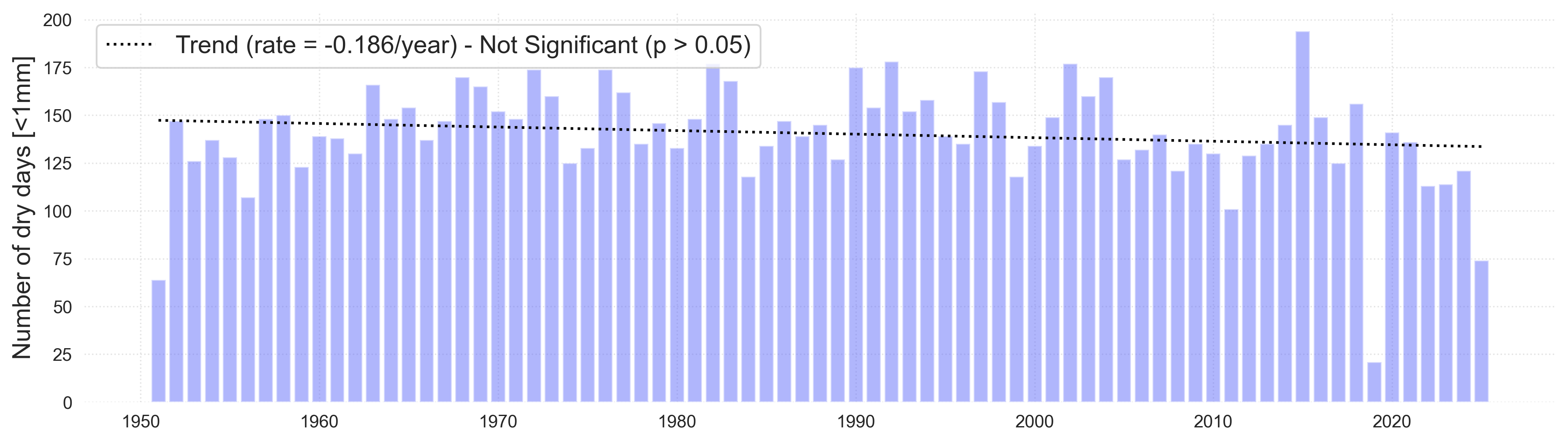
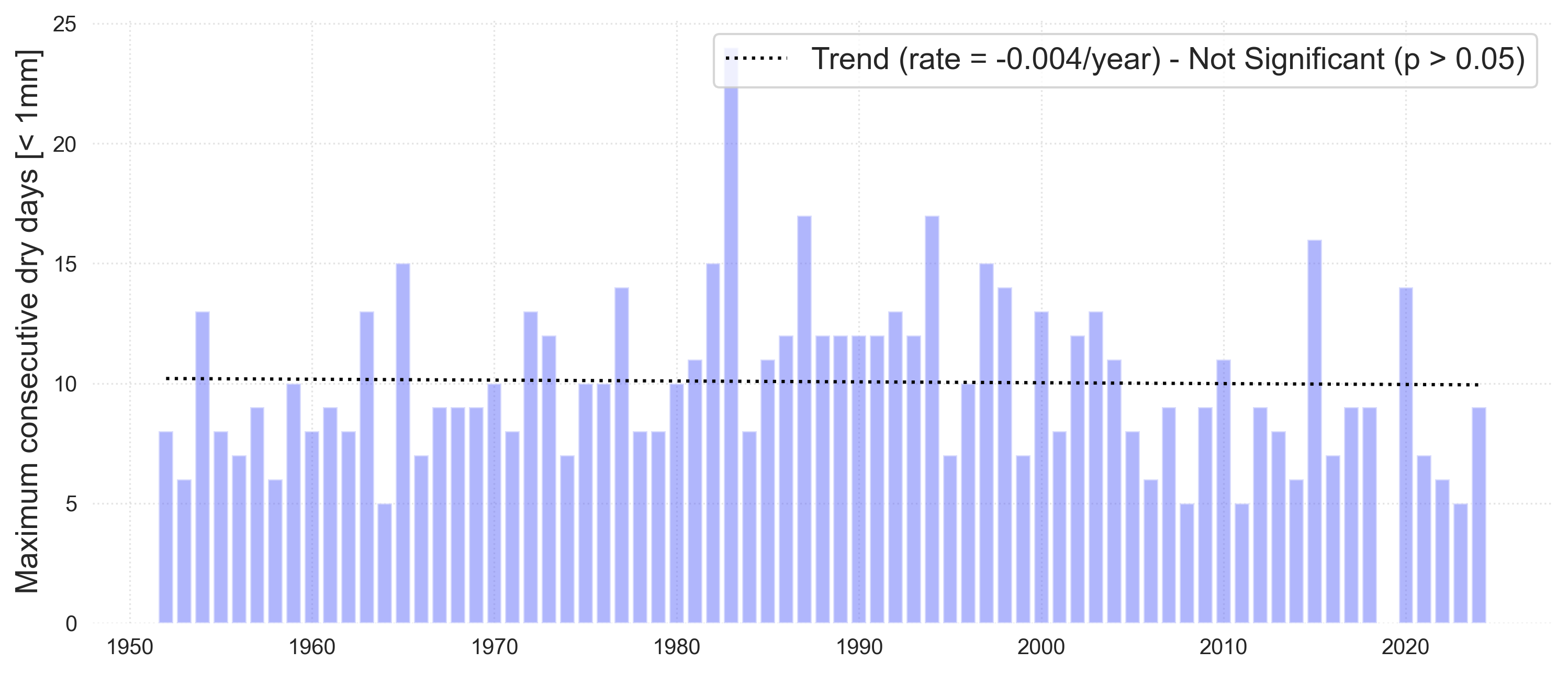
Figure 3 Annual dry days (top) and maximum number of consecutive days (bottom) over the period 1951–2024 at Koror.
Dry days are defined as days below 1mm (0.04 inches) threshold. Consecutive dry days is a measure of the longest sequence
of days in a year where rainfall is less than 1 mm (0.04 inches). The dashed black line represents a trend that is not
statistically significant.
|
 ç ç
Figure. Dry days
|
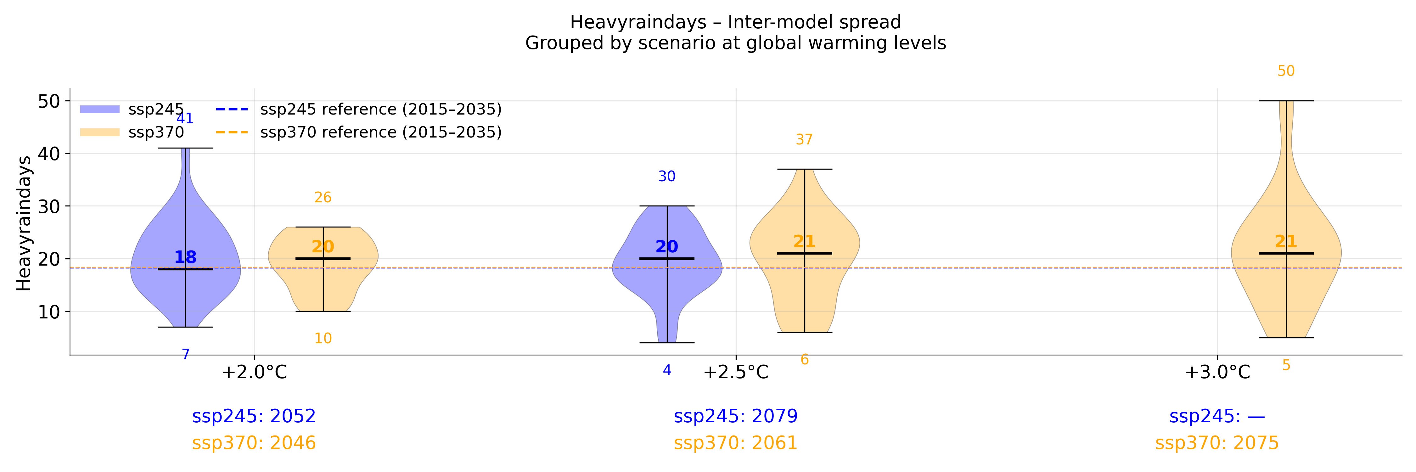
3.3. Heavy Rainfall |
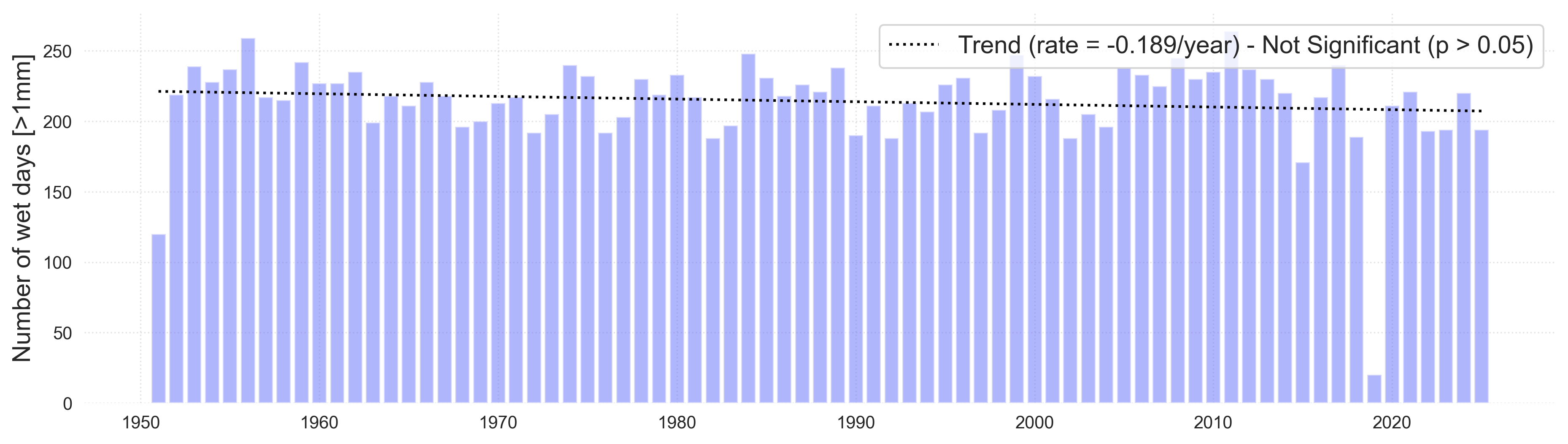
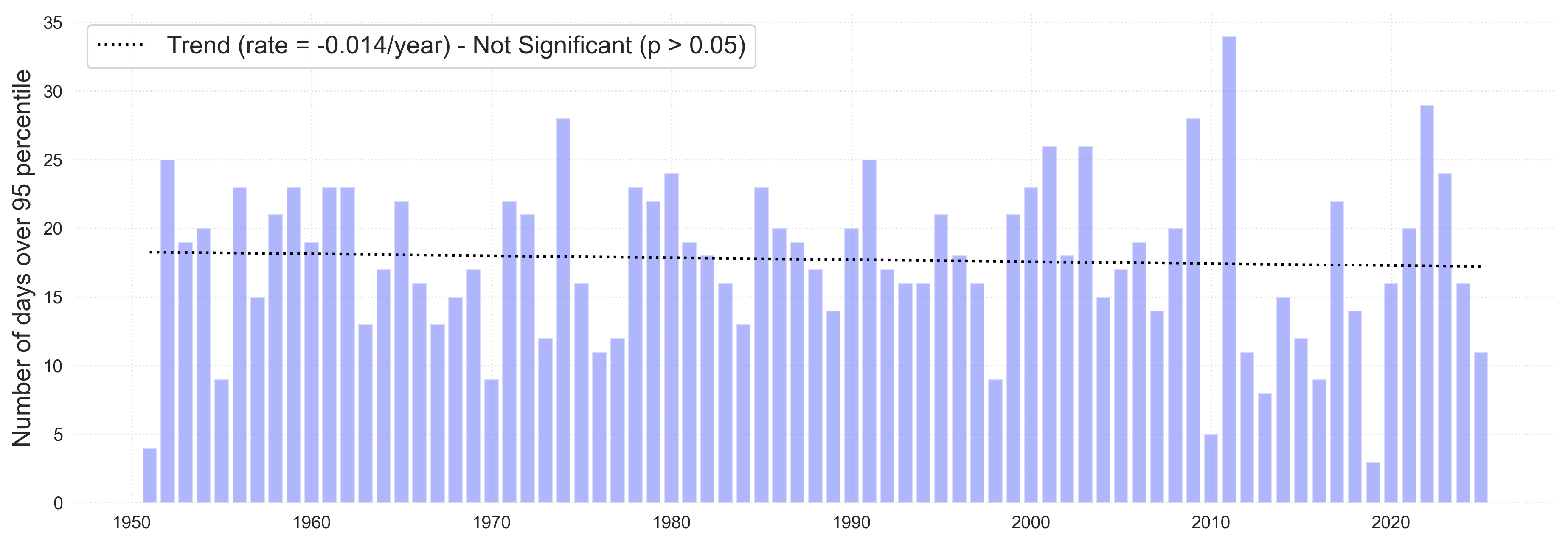
Figure 3 Annual wet days (top) and days with heavy rainfall (bottom) over the period 1951–2024 at Koror.
Wet days are defined as days above 1mm (0.04 inches). Heavy rainfall days are defined as days where rainfall is
greater than 45.7mm (1.98 inches), the 95th percentile. The solid black lines represent statistically significant
trends (p < 0.05). The dashed black line represents a trend that is not statistically significant.
|
 ç ç
Figure. Heavy rainfall
|
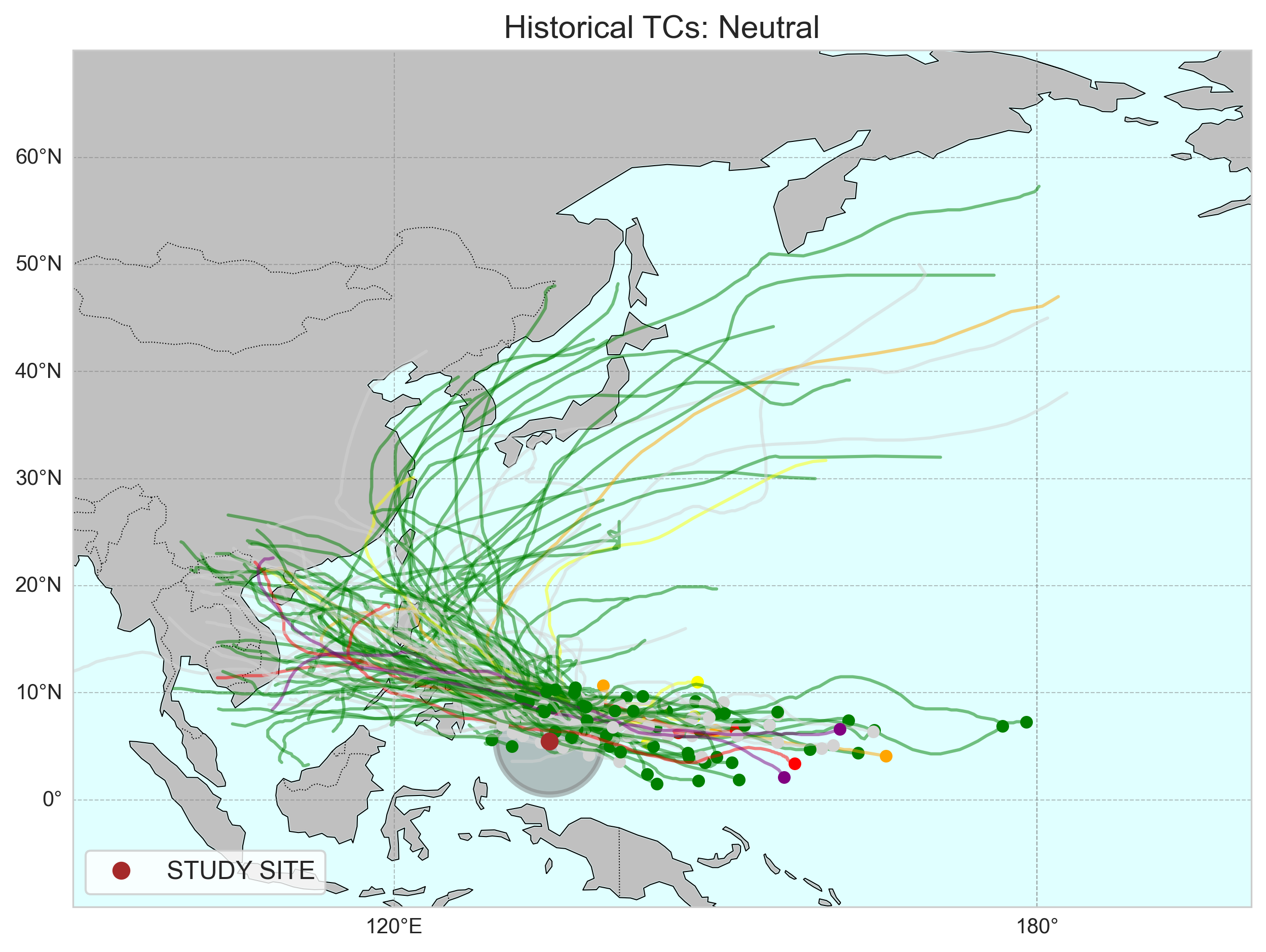
| 4. Tropical Cyclones | 4.1 All Tropical Cyclones |
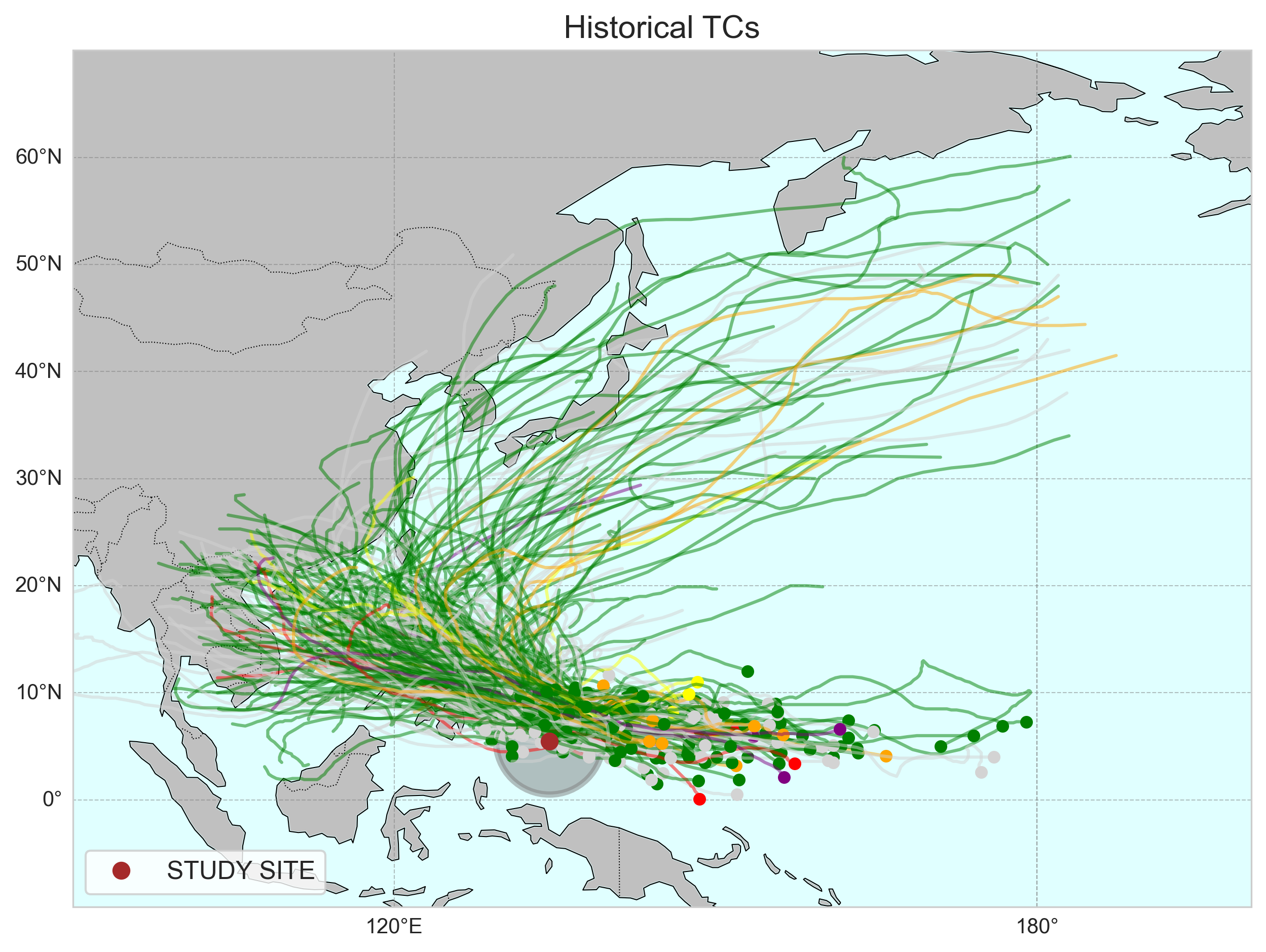
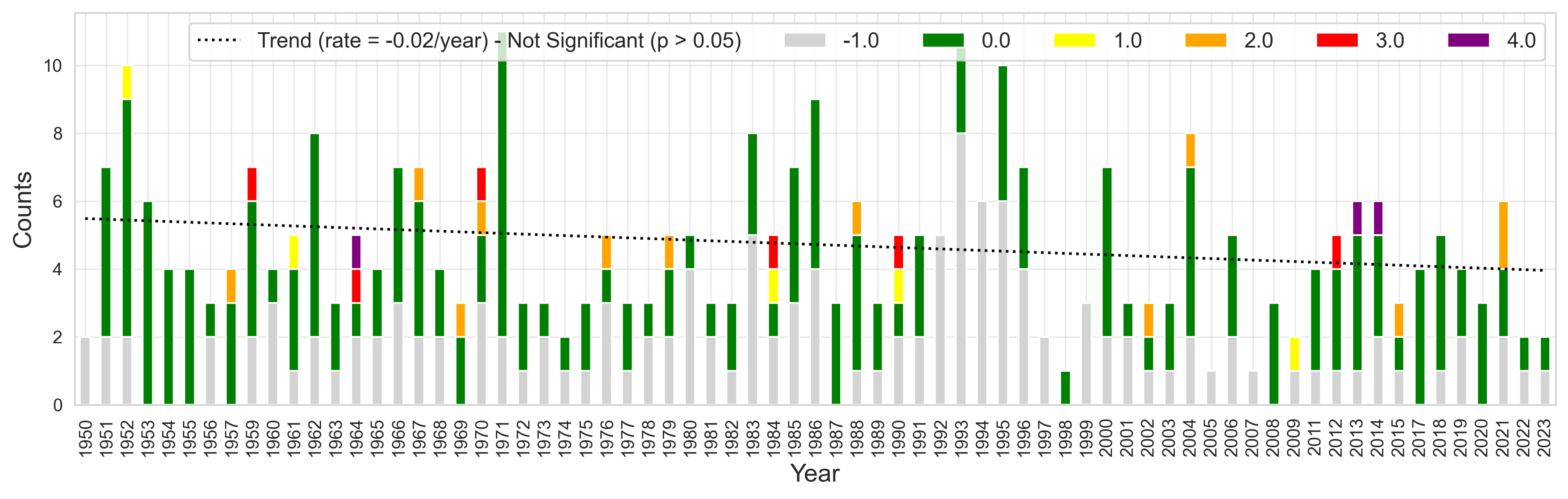
Figure Tropical cyclones (TCs) in the vicinity of Palau since 1950. Categorizes are colored following the
Saffir Simpson scale for wind intensity (see text for details). Grey represents TCs where no wind information
is available. The dashed black line represents a trend that is not statistically significant.
Figure 8 Tropical cyclones (TCs) in the vicinity of Palau since 1950. Map showing all TC tracks
in the vicinity of Palau (top) and annual storm count (bottom). Categorizes are colored following the
Saffir Simpson scale for wind intensity (see text for details). Grey represents TCs where no wind information
is available. The dashed black line represents a trend that is not statistically significant.
|
|
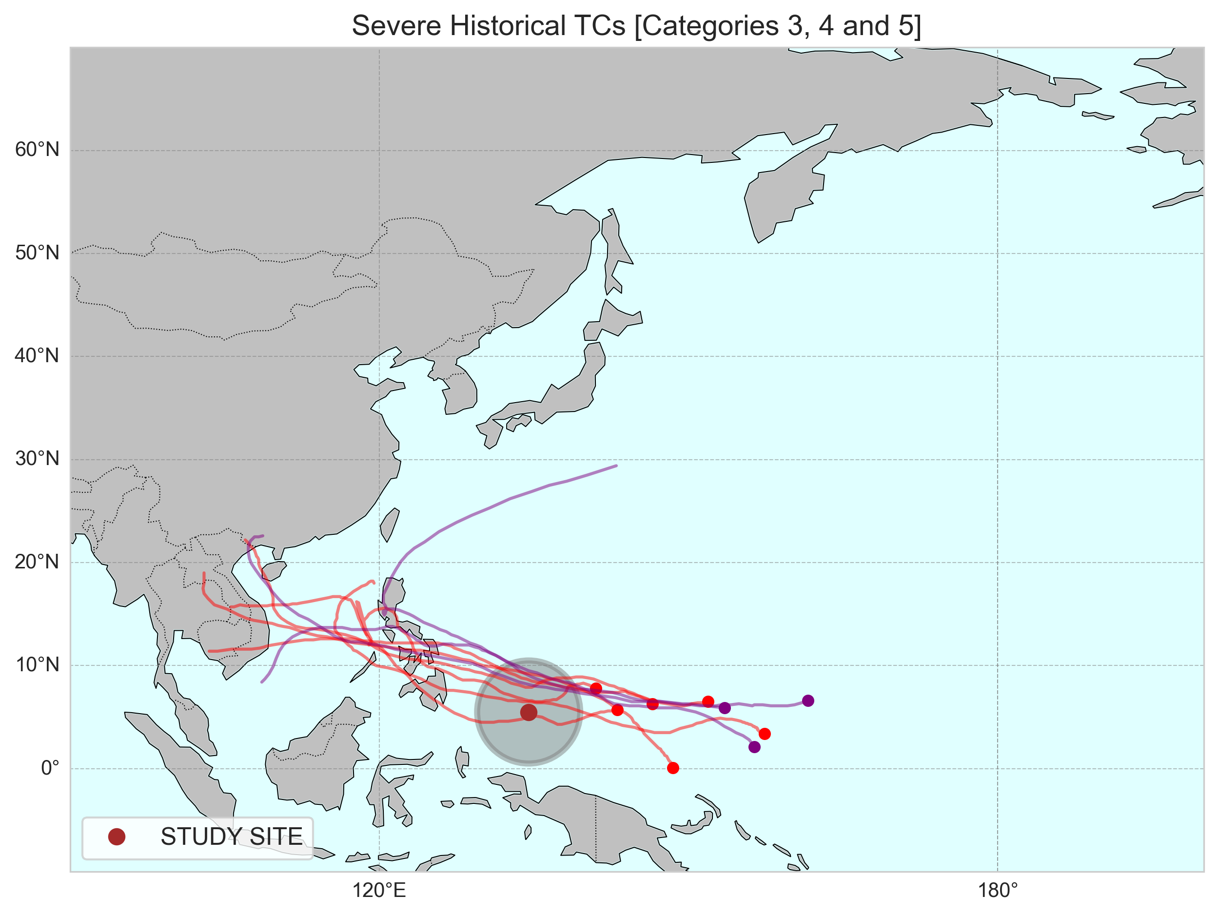
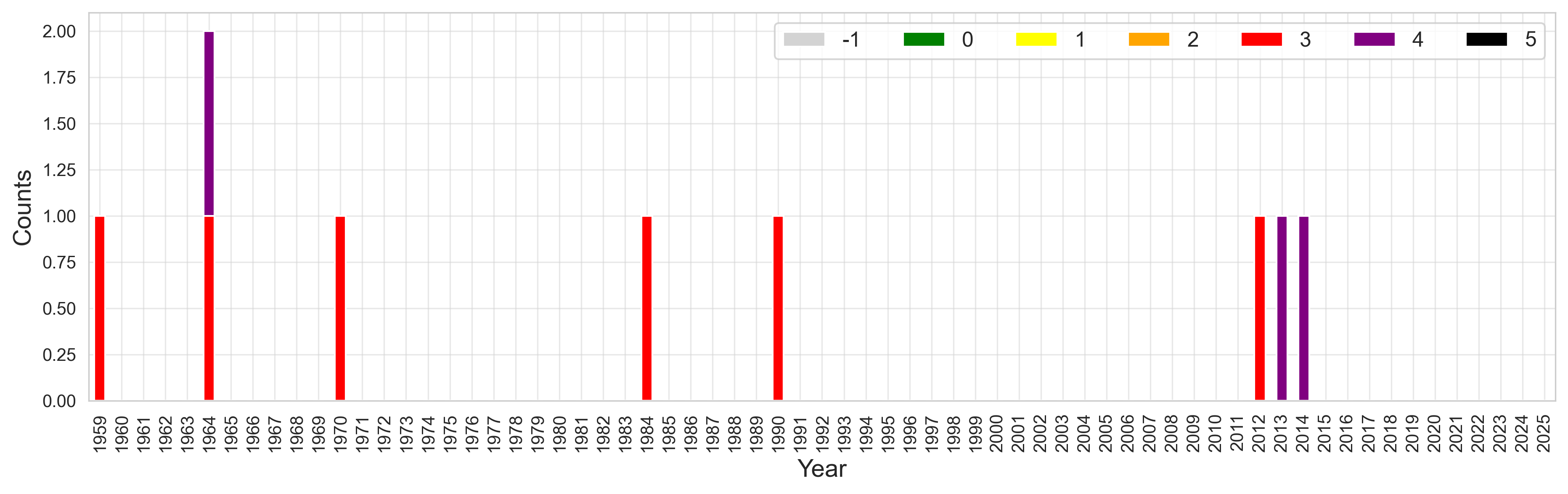
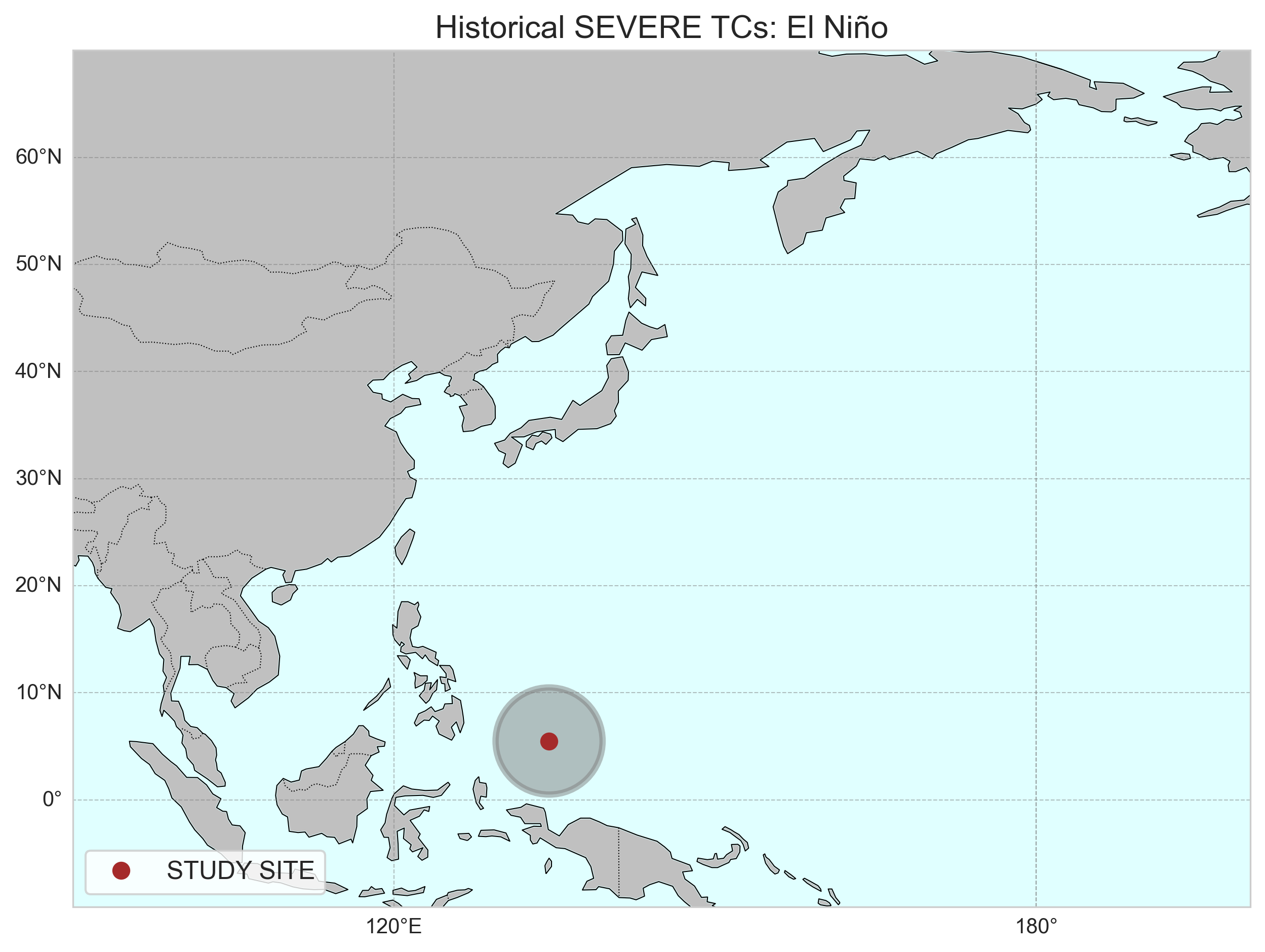
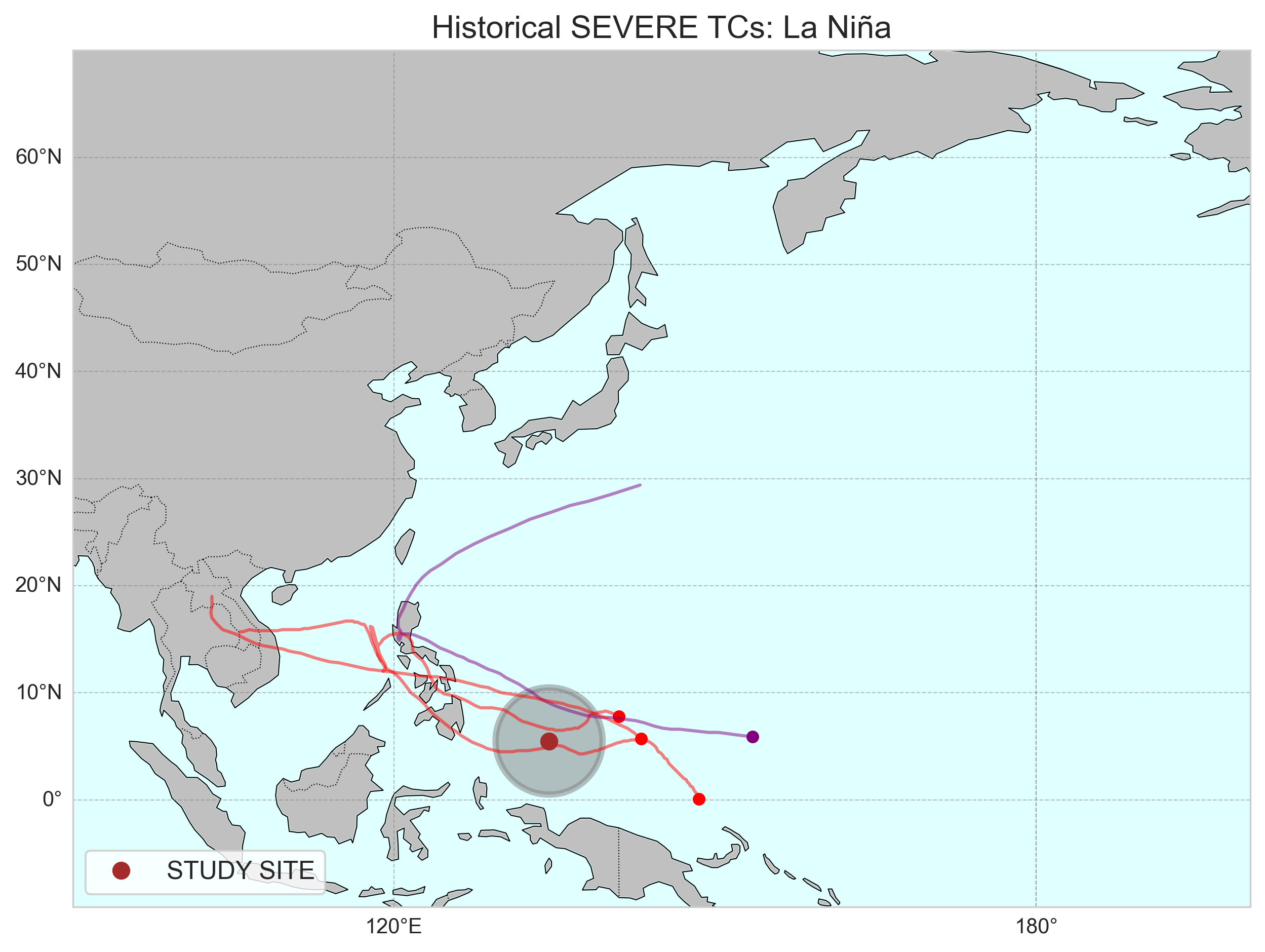
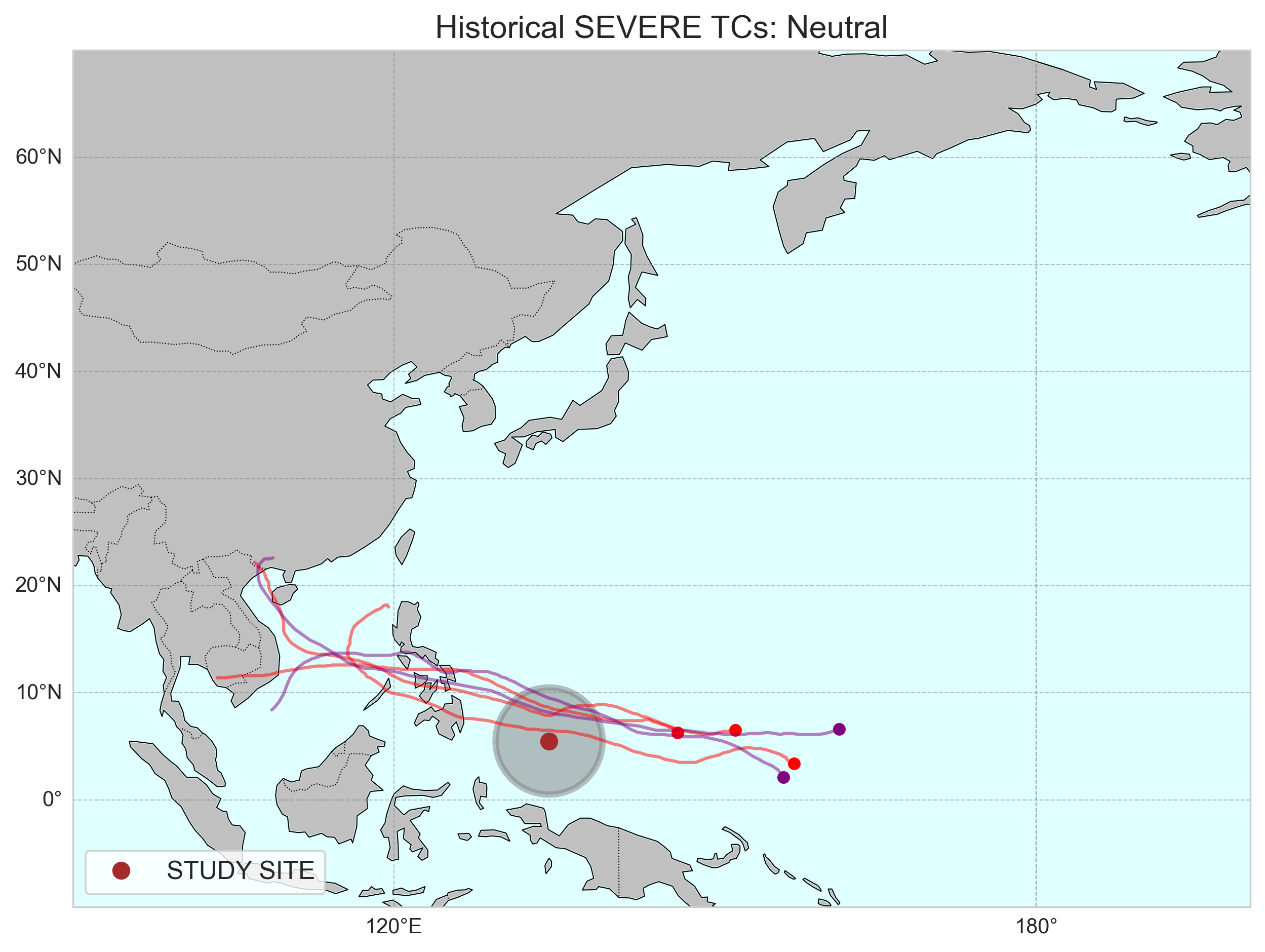
4.2. Severe Tropical Cyclones |
Figure Severe Tropical cyclones (TCs) in the vicinity of Palau since 1950. Severe cyclones
are those classified as Category 3 or greater on the Saffir Simpson scale (i.e., winds greater than
96kt [110 miles/hour]). The dashed black line represents a trend that is not statistically significant.
Figure 9 Severe Tropical cyclones (TCs) in the vicinity of Palau since 1950. Map showing
all severe TC tracks in the vicinity of Palau (top) and annual storm count (bottom). Severe cyclones
are those classified as Category 3 or greater on the Saffir Simpson scale (i.e., winds greater than
96kt [110 miles/hour]). The dashed black line represents a trend that is not statistically significant.
|
|
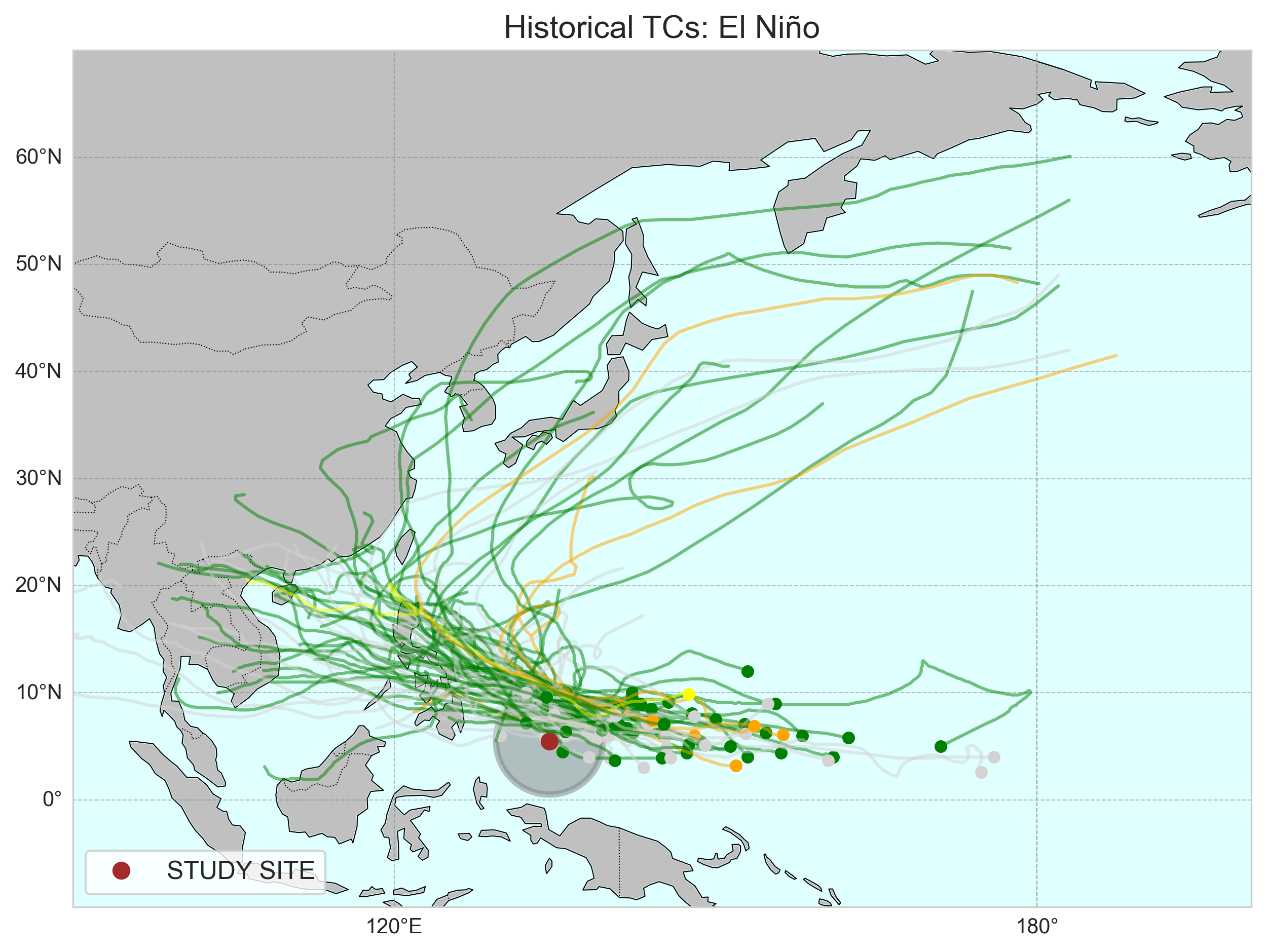
4.3. ENSO Analysis |
Figure 3 Historical TCs during El Niño, La Niña, and Neutral years.
|
|
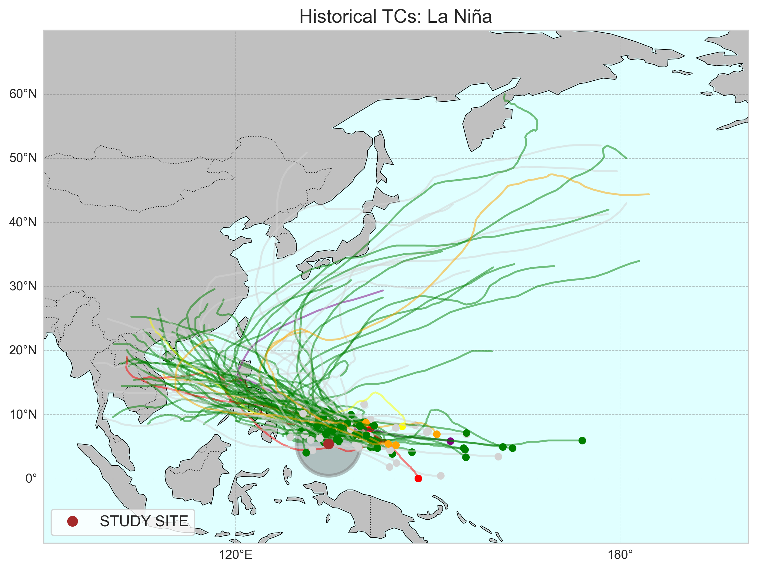
4.4. ENSO Historical Severe TCs |
Figure 3 Historical TCs during El Niño, La Niña, and Neutral years.
|
|
| Ocean | 1.Sea Level | 1.1.1 Linear Trend |
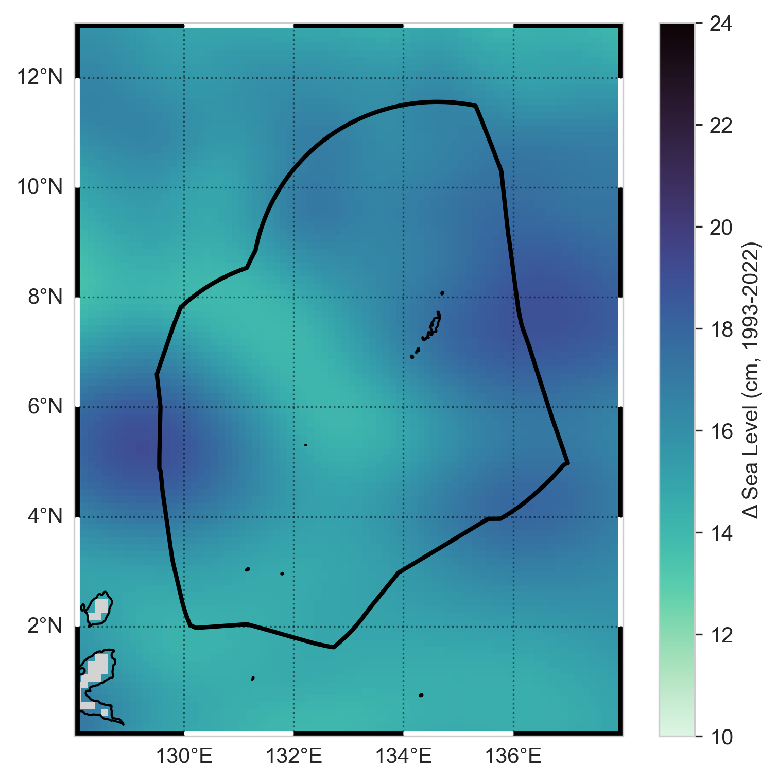
Figure 10 Figure 10. Sea Level Change from Satellite Altimetry.
This map shows the (absolute) change in mean sea level in the vicinity of
Palau from satellite altimetry since the beginning of the satellite record (1993-2022).
For comparison, the (relative) value for the tide gauge at Malakal is shown as a circle in
the center of the figure. The black line is the Palau EEZ.
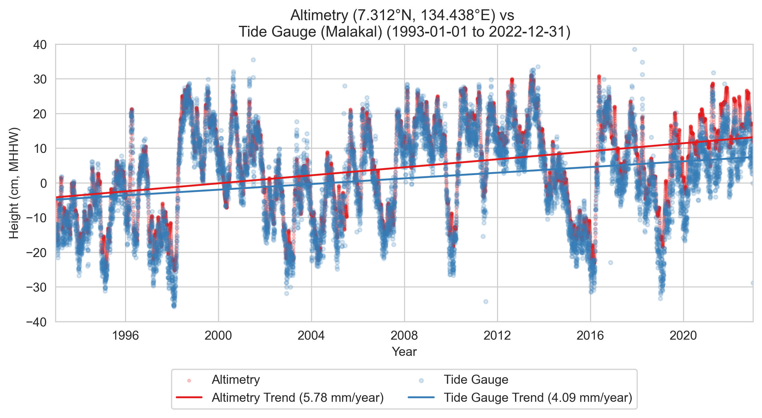
Figure 11 Sea Level Trends at Malakal. This plot shows the change in mean sea level recorded
at the tide gauge at Malakal (blue) and from satellite altimetry in the vicinity of the station (red)
since the beginning of the satellite record (1993-2022). In both cases the trends are statistically
significant (p < 0.05).
|
|
| 1.1.1 Flooding |
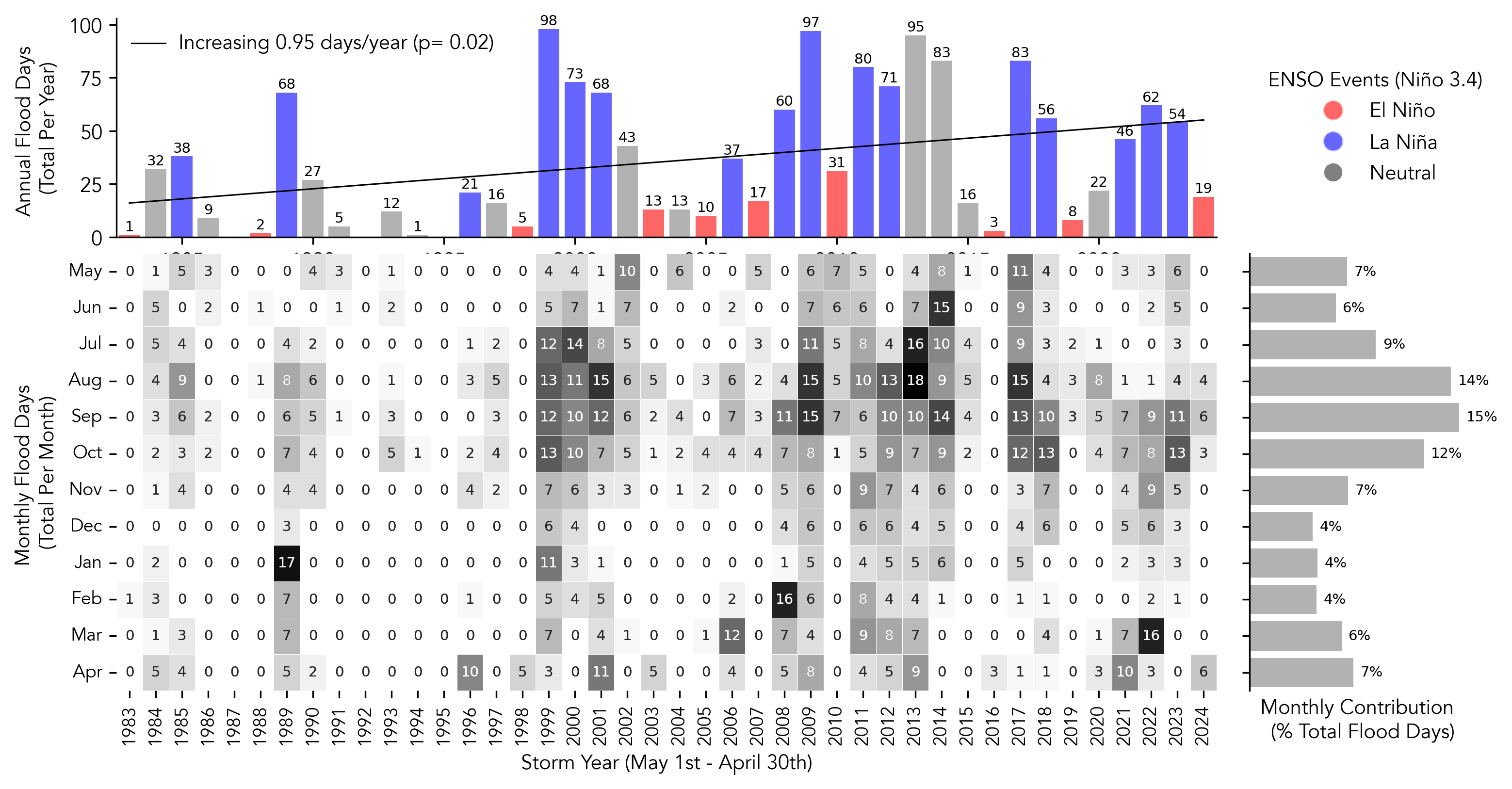
Figure 12 Minor flood frequency from tide gauge at Malakal. The heatmap plot (bottom left)
shows the total number of minor flood days by month/per year for storm years 1983–2024.
The bar plot (top) shows the annual total of minor flood days for the year combined.
Bars colors indicate the occurrence of an ENSO event within that storm year
(red, El Niño; blue, La Niña). The black line shows a significant trend (p<0.05)
of annual flood days over 1983-2024. Flood days are defined as any day in which the water
level exceeds 30 cm above MHHW for at least one hour.
|
|
||
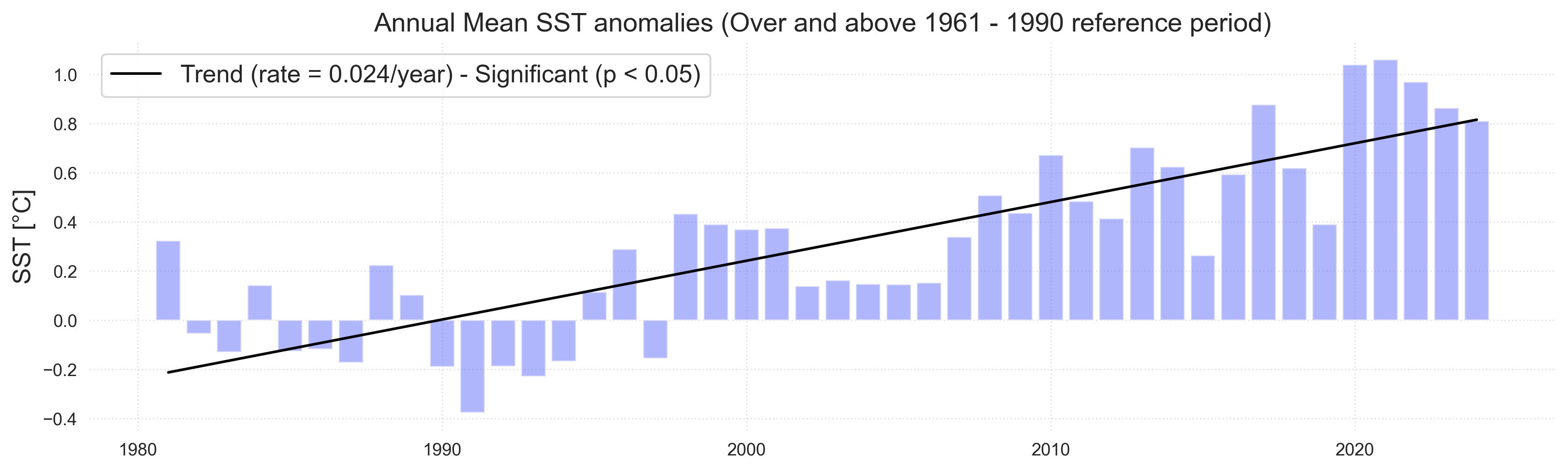
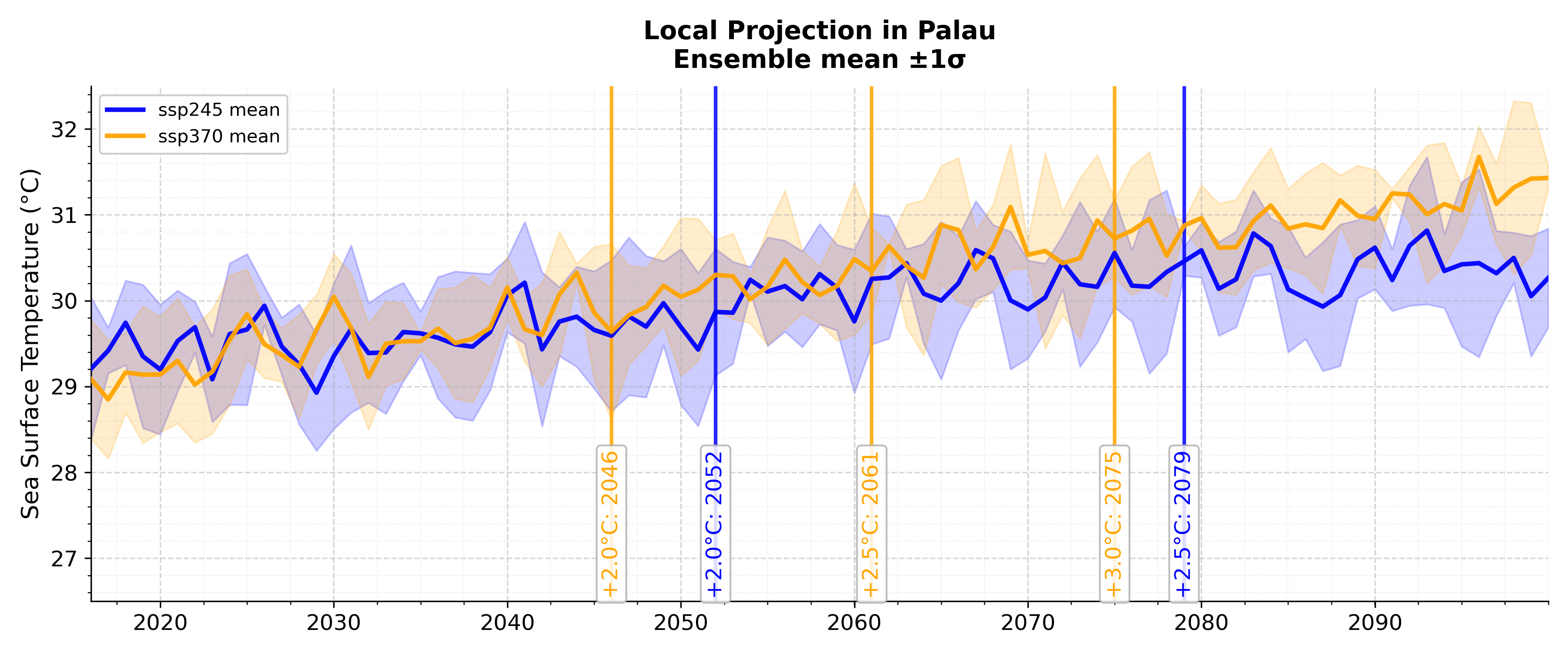
| 2. Ocean Temperature | 2.1 Mean Sea Surface Temperature |
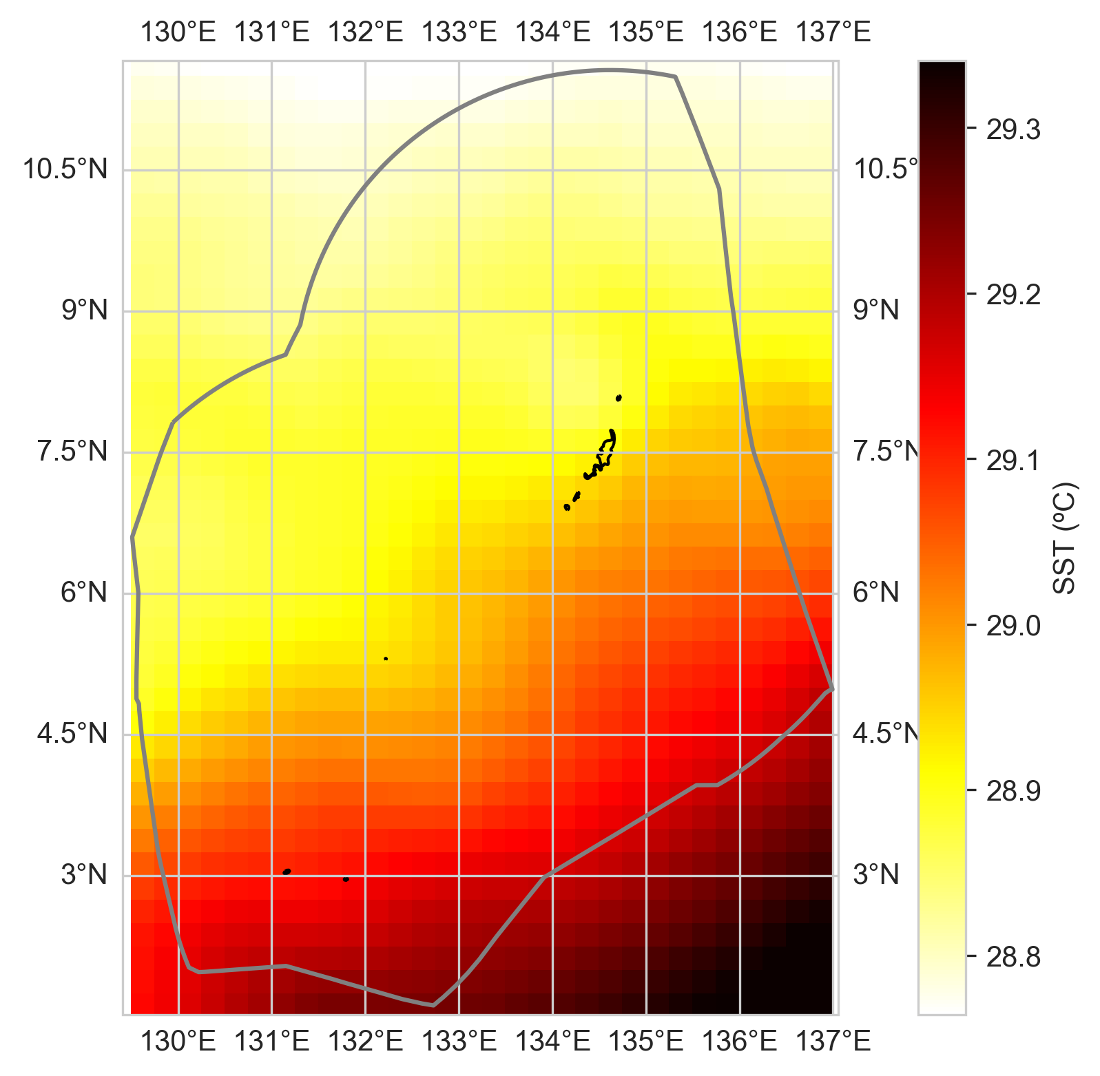
Figure 13 Sea Surface Temperature (SST) Change from satellite. The map (top)
shows the change in mean SST (°C per decade) in the vicinity of Palau over the period
1982–2020 from the NOAA OISSTv2 satellite. The grey line is the Palau EEZ. The line
plot shows the change in mean SST averaged over the area within the top plot.
|
 ç ç
 ç ç
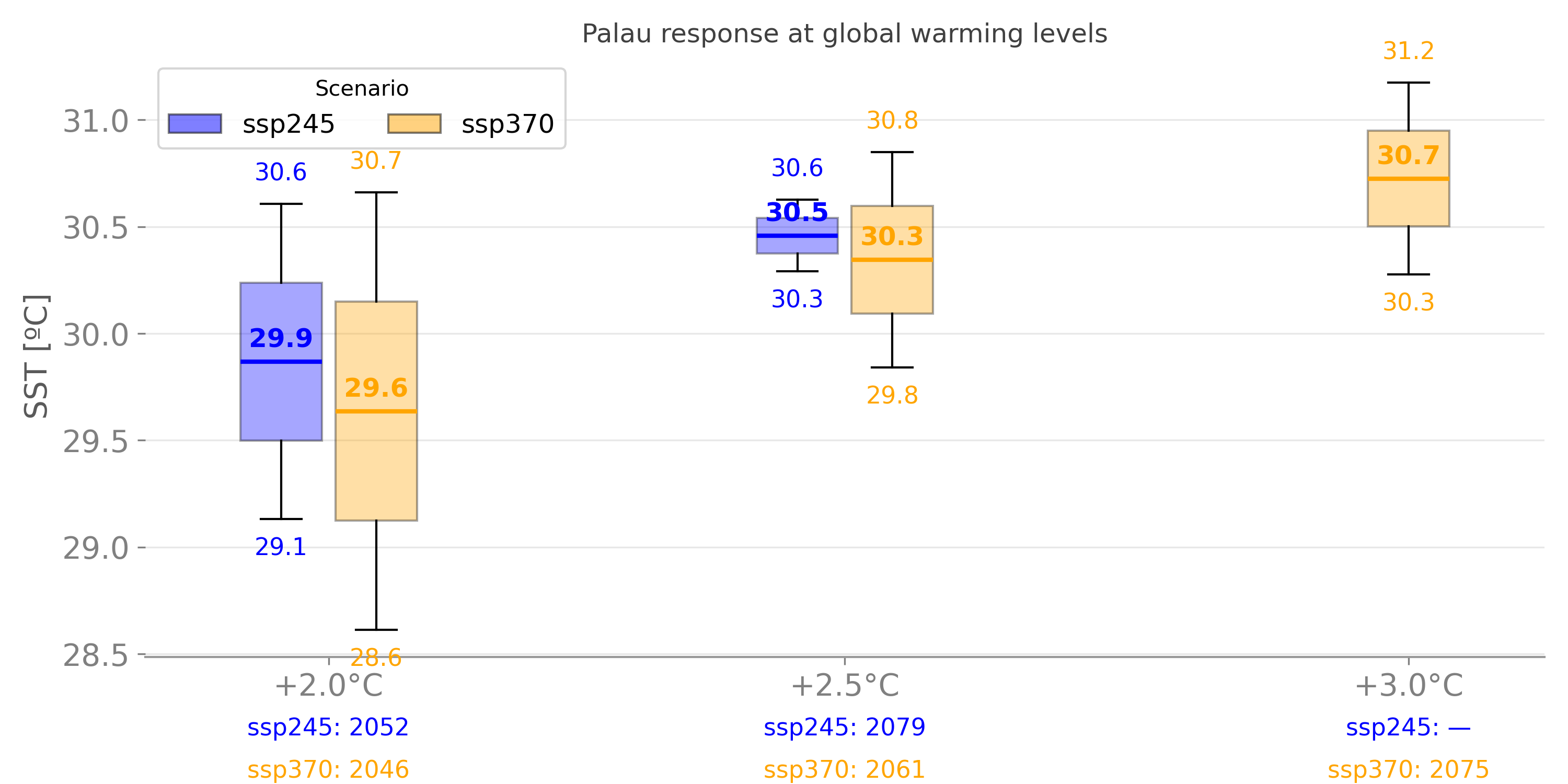
Figure. Sea surface temperature
|
|
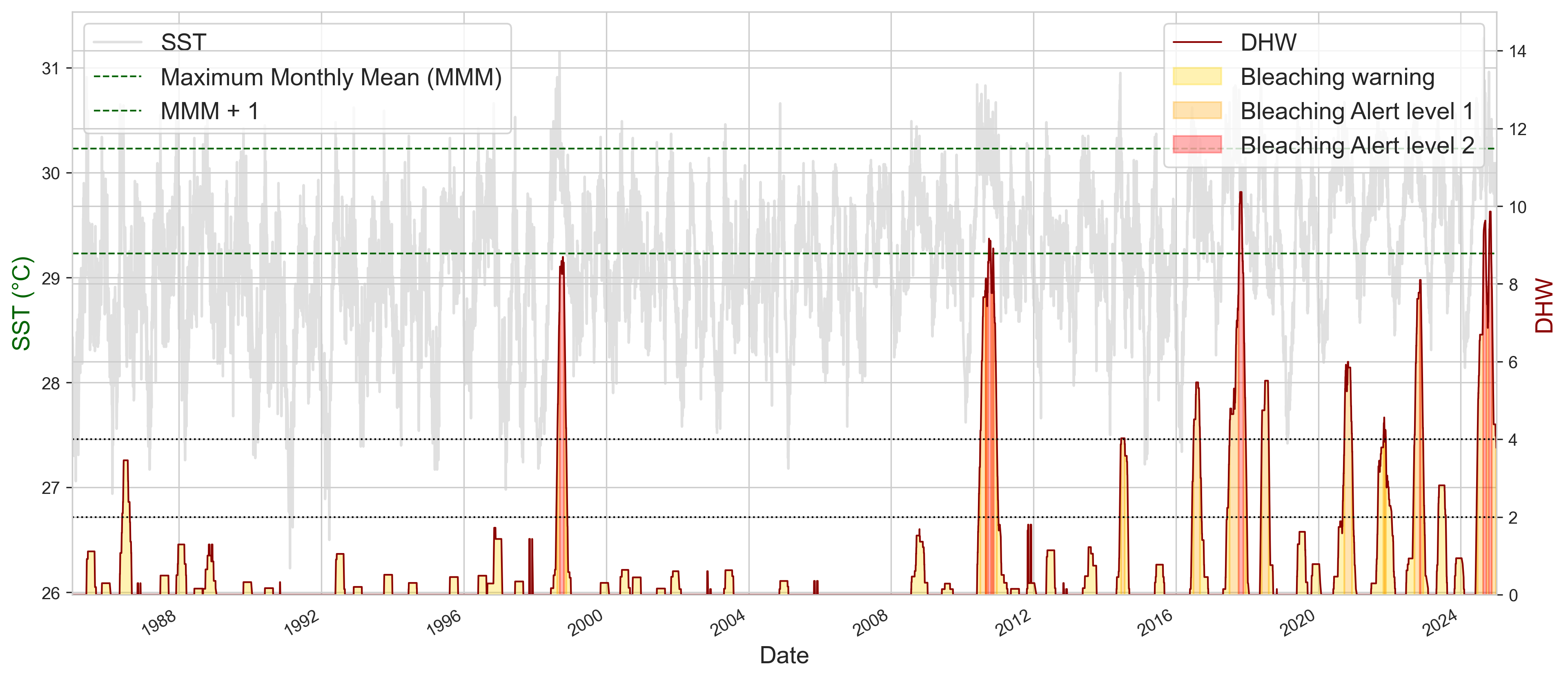
| 2.2 Heat stress (DHW/MHW) |
Figure 14 Sea Surface Temperature (SST) from satellite and ENSO state.
The maps show the change in mean SST (°C per decade) in the vicinity of Palau over
the period 1982–2020 from the NOAA OISSTv2 satellite under different ENSO states
(i.e., La Niño, Neutral, El Niño). The grey line is the Palau EEZ.
|
 ç ç
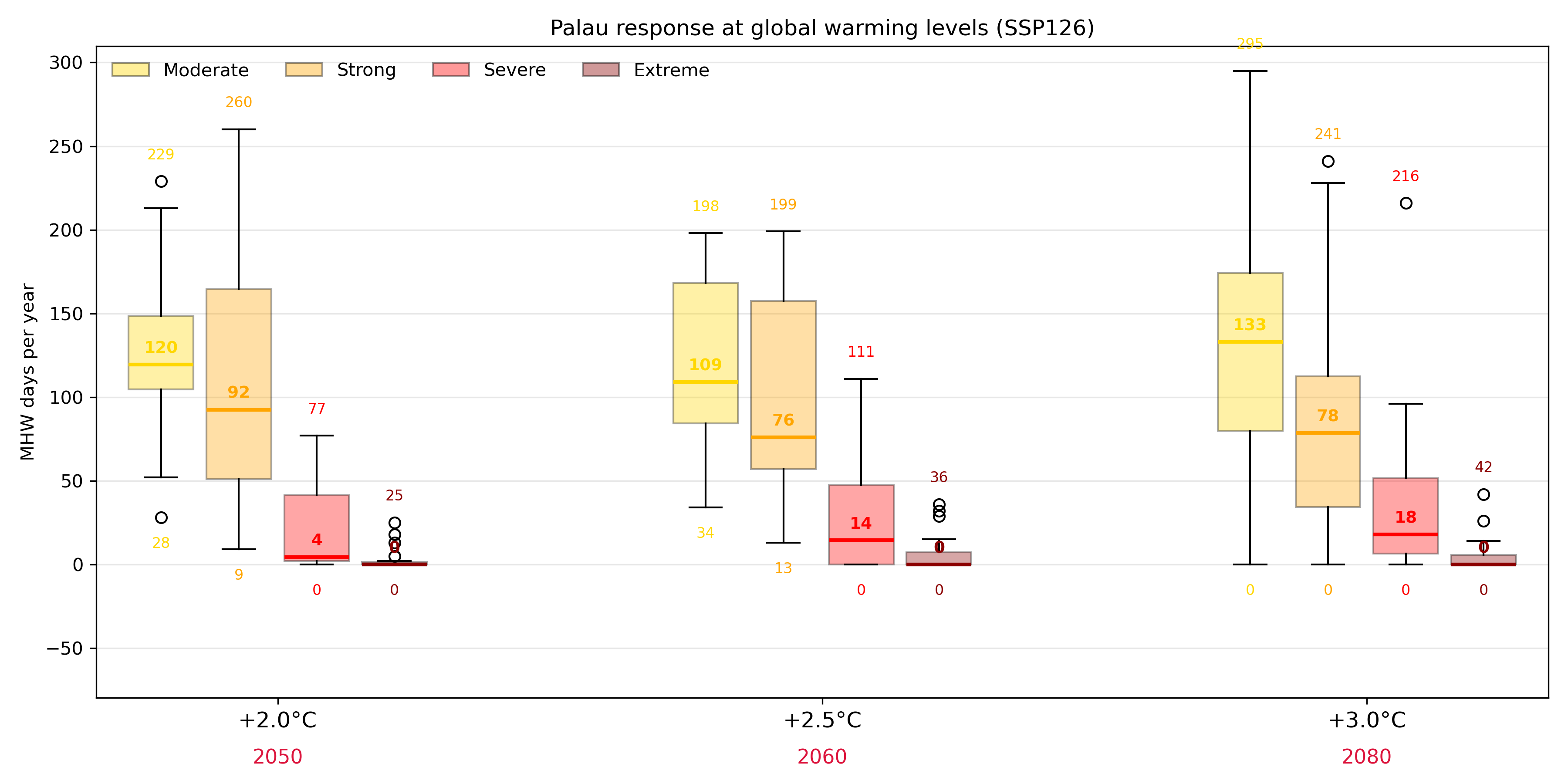
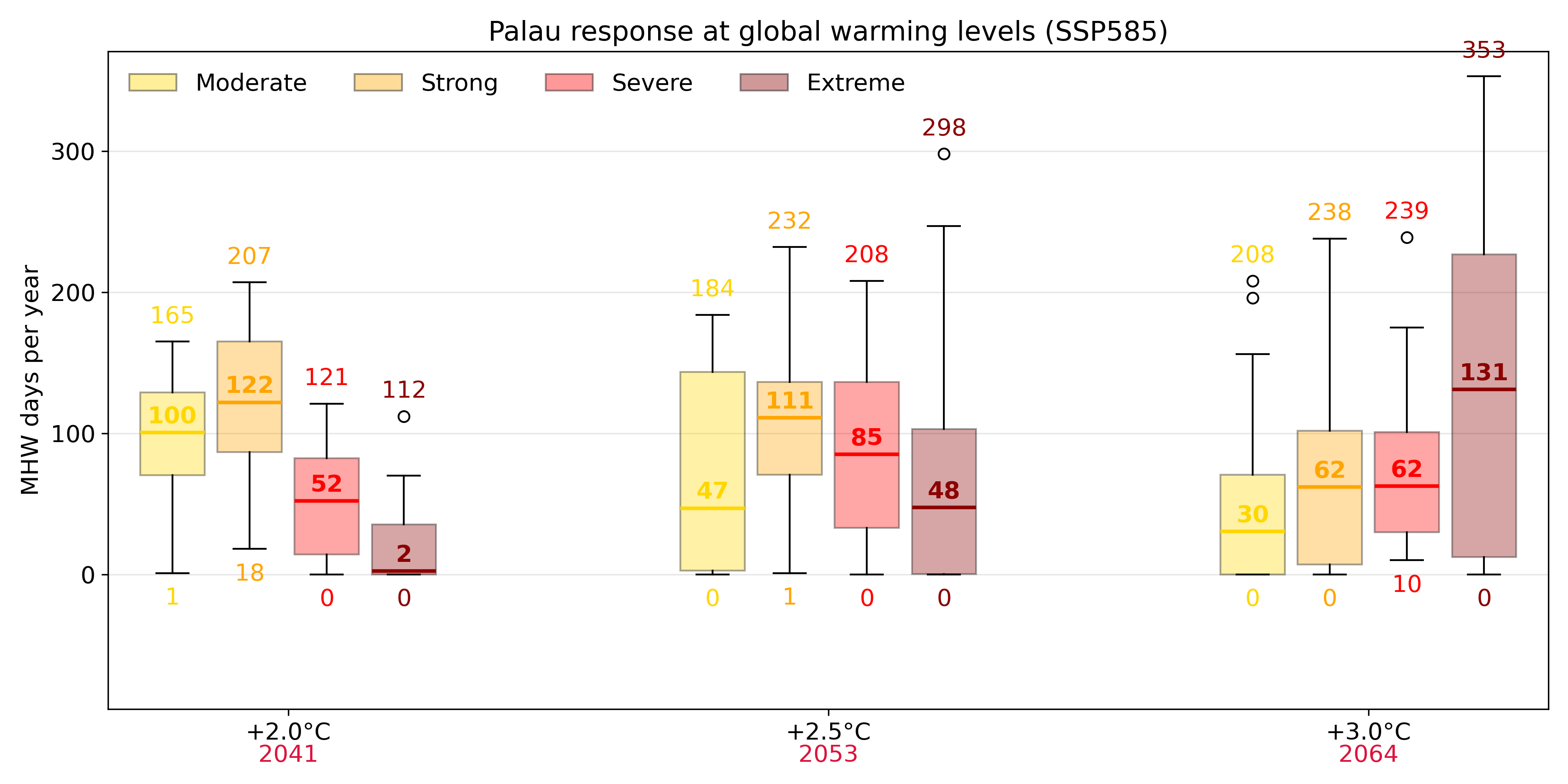
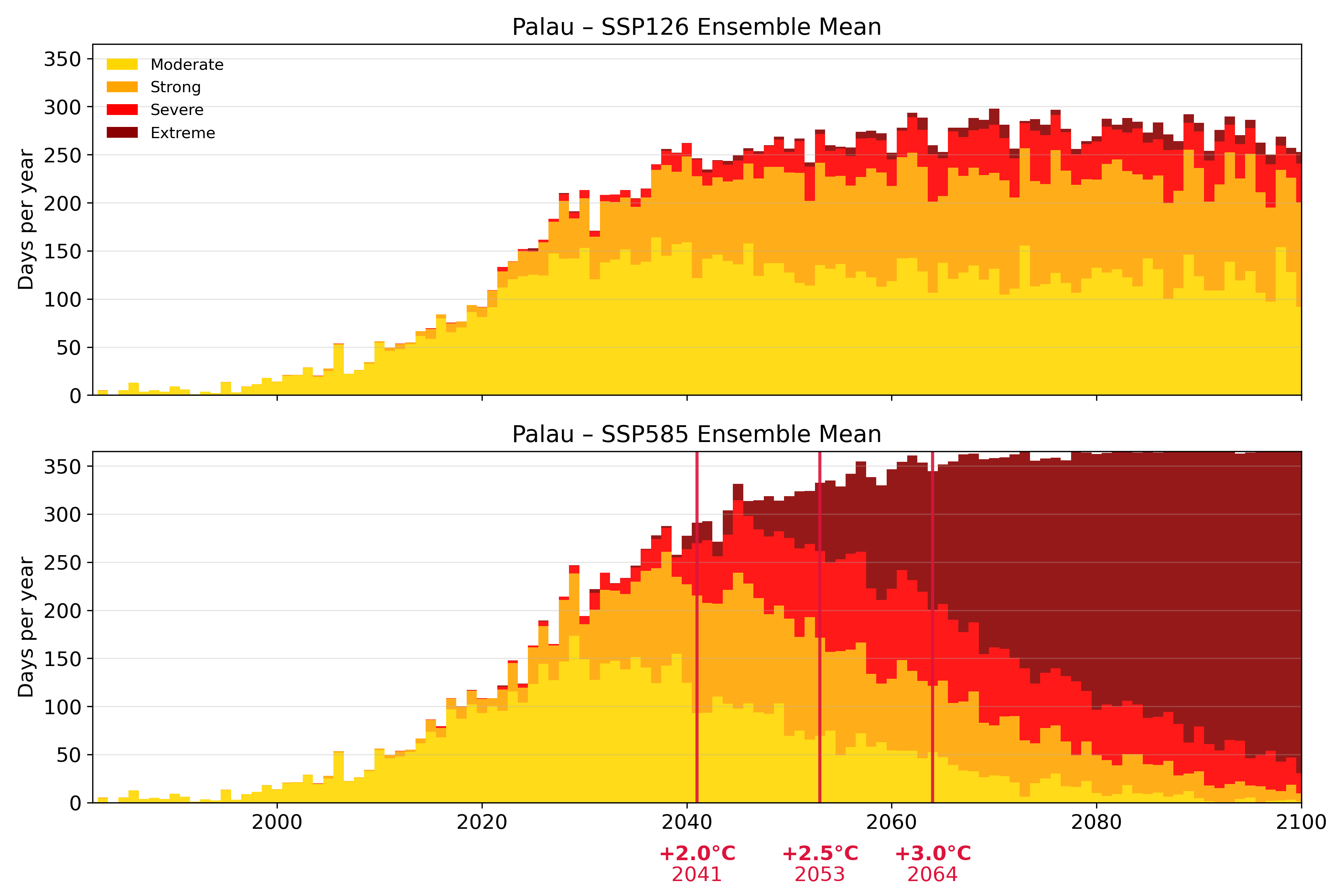
Figure. MHW
|
||
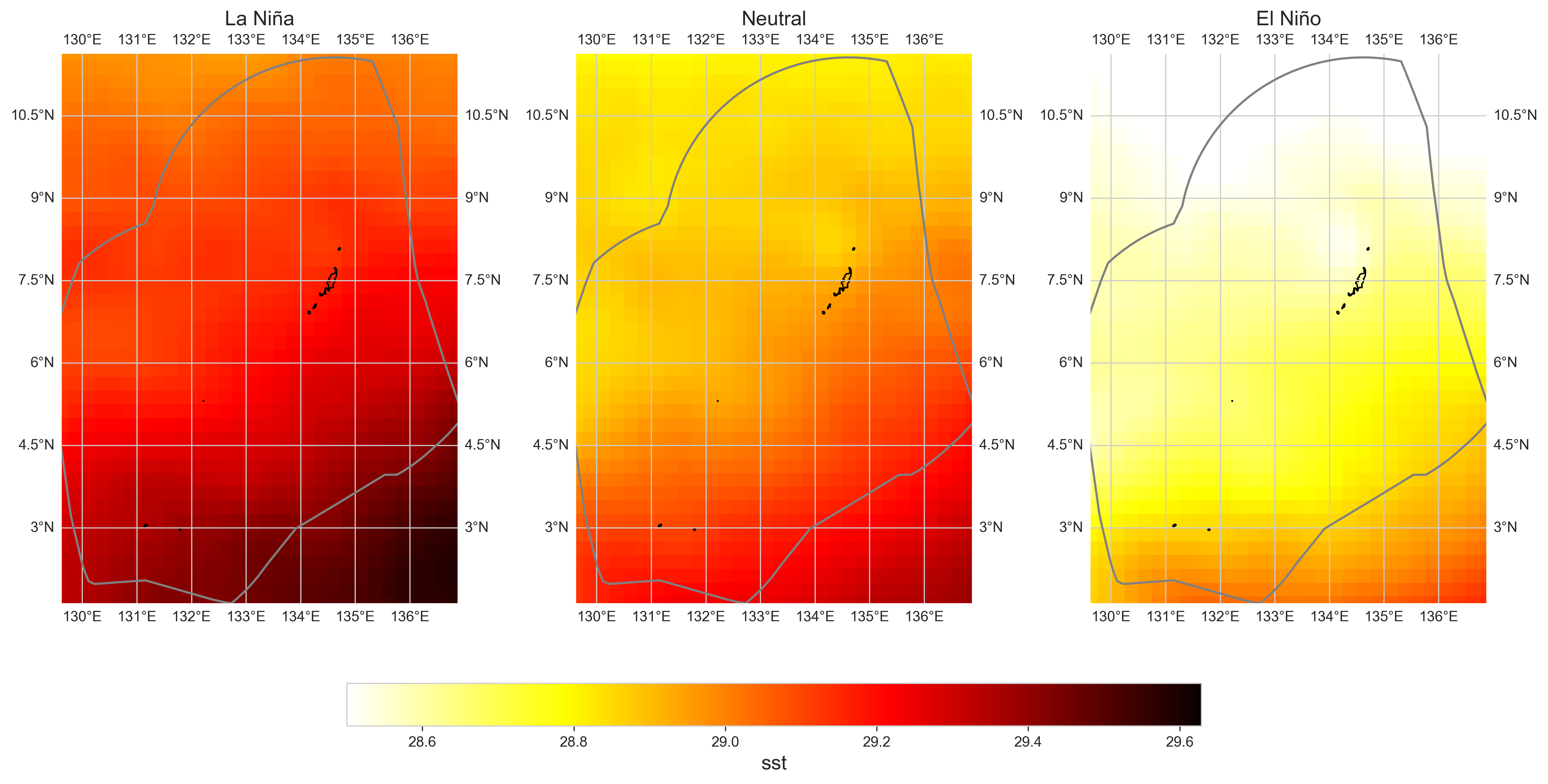
| 1.3 ENSO Analysis |
Figure 14 Sea Surface Temperature (SST) from satellite and ENSO state.
The maps show the change in mean SST (°C per decade) in the vicinity of Palau over
the period 1982–2020 from the NOAA OISSTv2 satellite under different ENSO states
(i.e., La Niño, Neutral, El Niño). The grey line is the Palau EEZ.
|
|
||
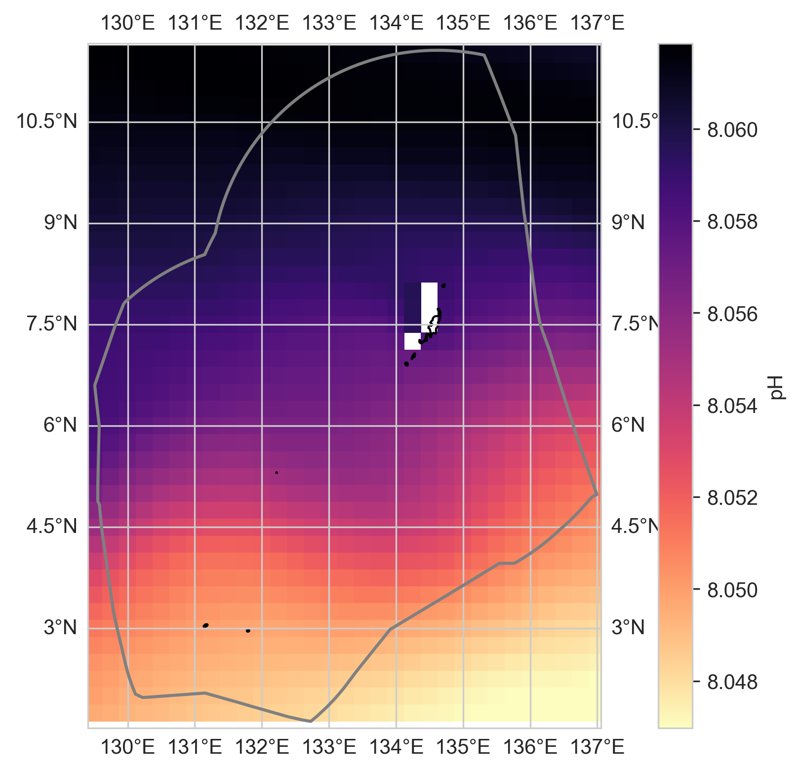
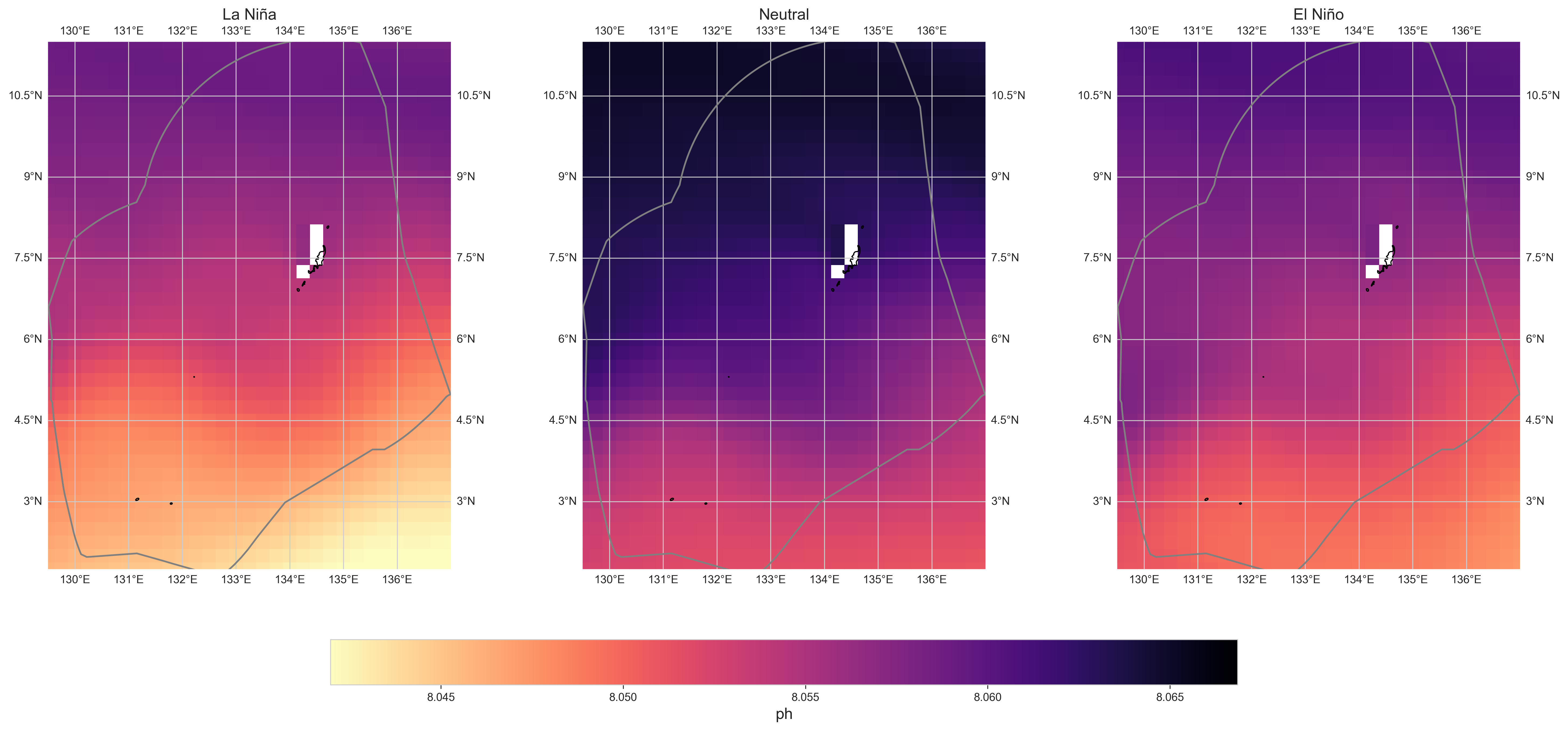
| 3. Ocean Acidification: pH | 3.1 pH Trends |
Figure 14 pH
Figure 14 pH trends
|
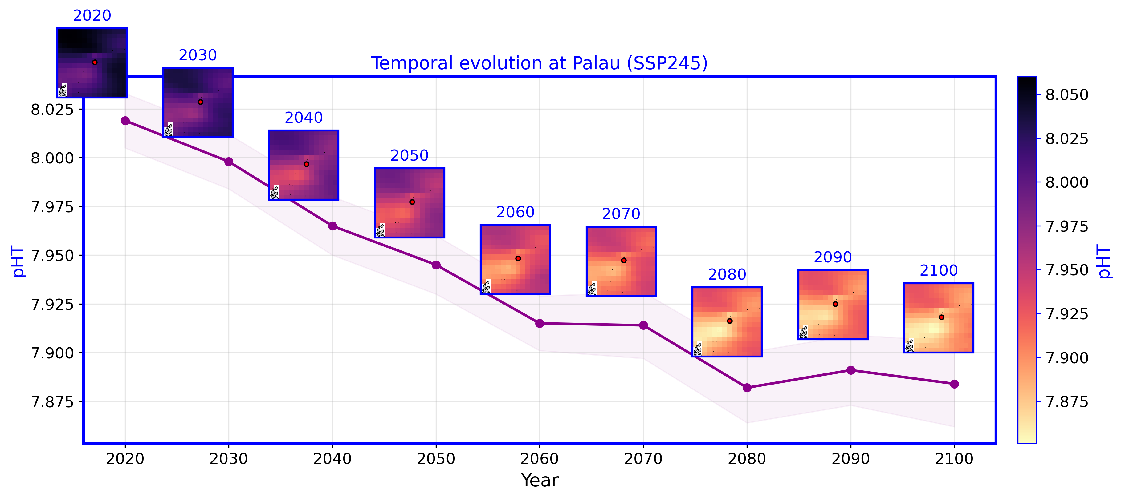
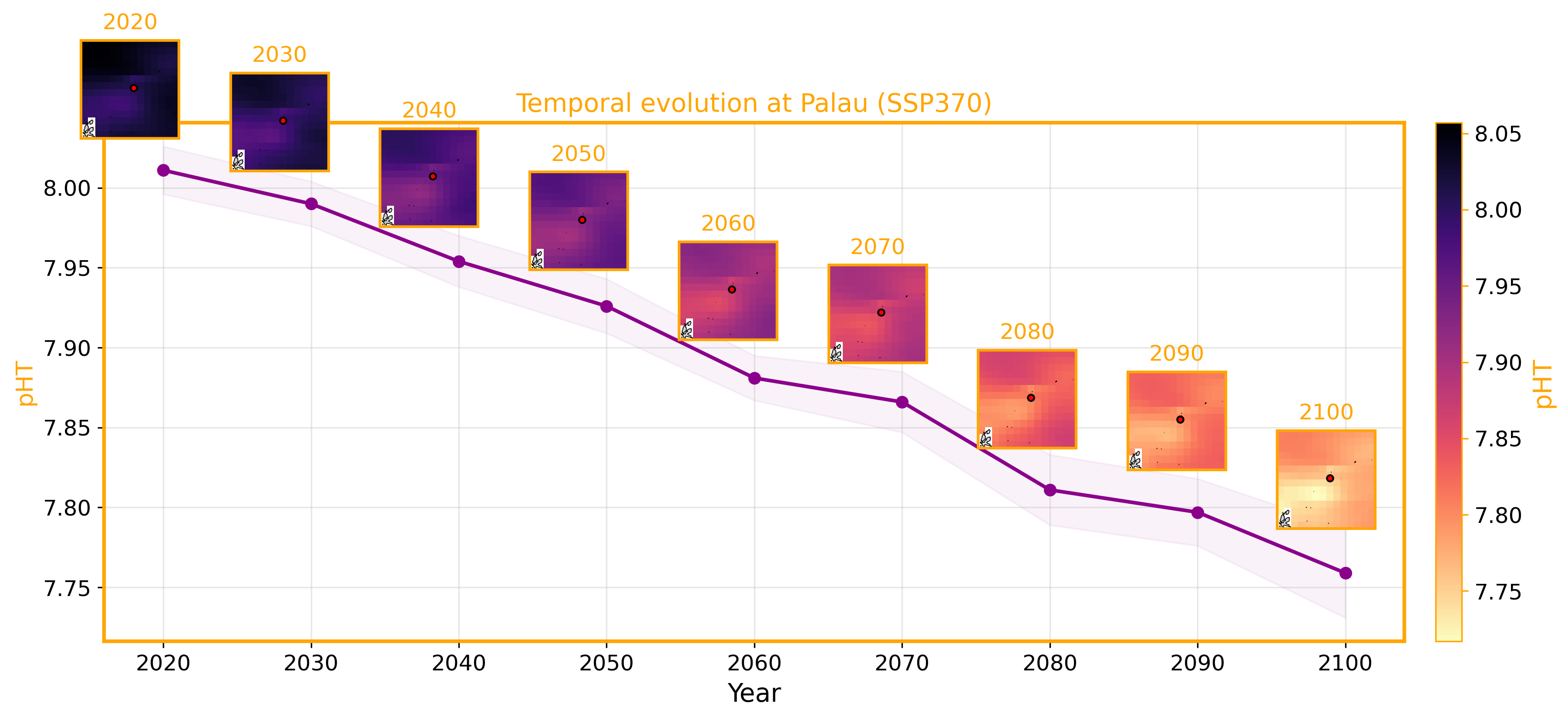
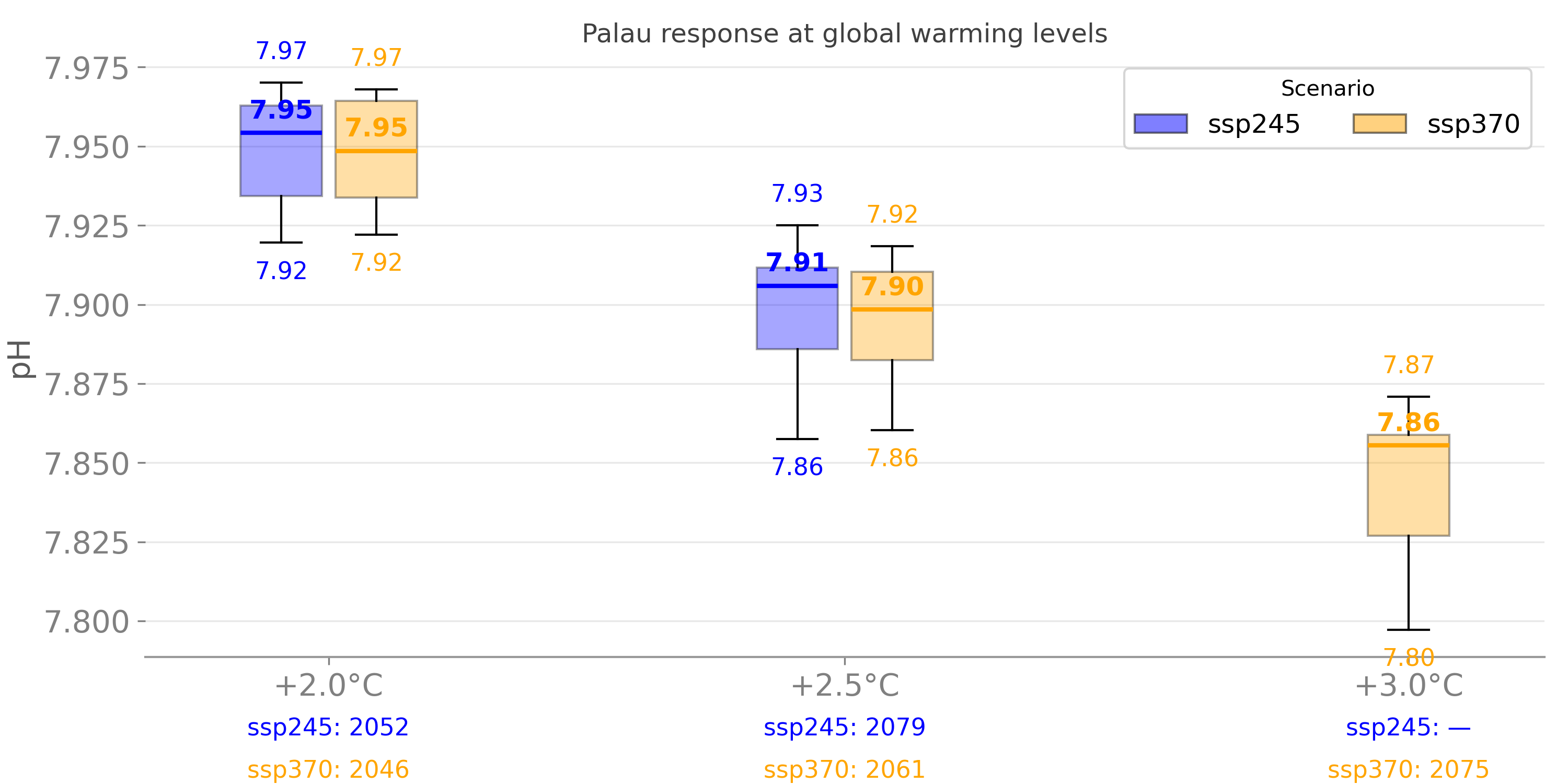
Figure. pH
|
|
| 1.3 ENSO Analysis |
Figure 14 Sea Surface Temperature (SST) from satellite and ENSO state.
The maps show the change in mean SST (°C per decade) in the vicinity of Palau over
the period 1982–2020 from the NOAA OISSTv2 satellite under different ENSO states
(i.e., La Niño, Neutral, El Niño). The grey line is the Palau EEZ.
|
|
||
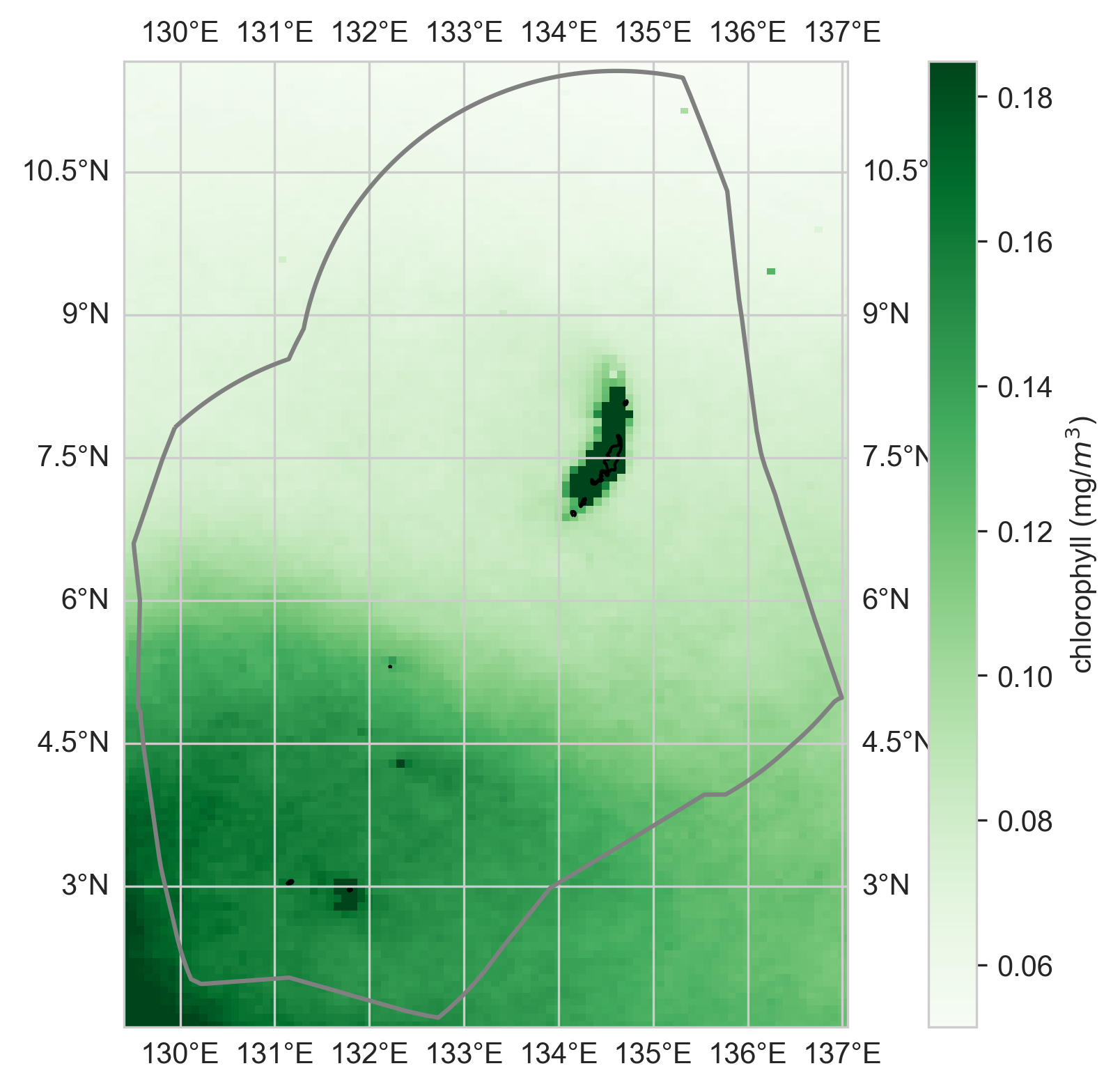
| 4. Chlorophyll | 4.1 Chlorophyll Concentration |
Figure 14 pH
Figure 14 pH trends
|
|
|
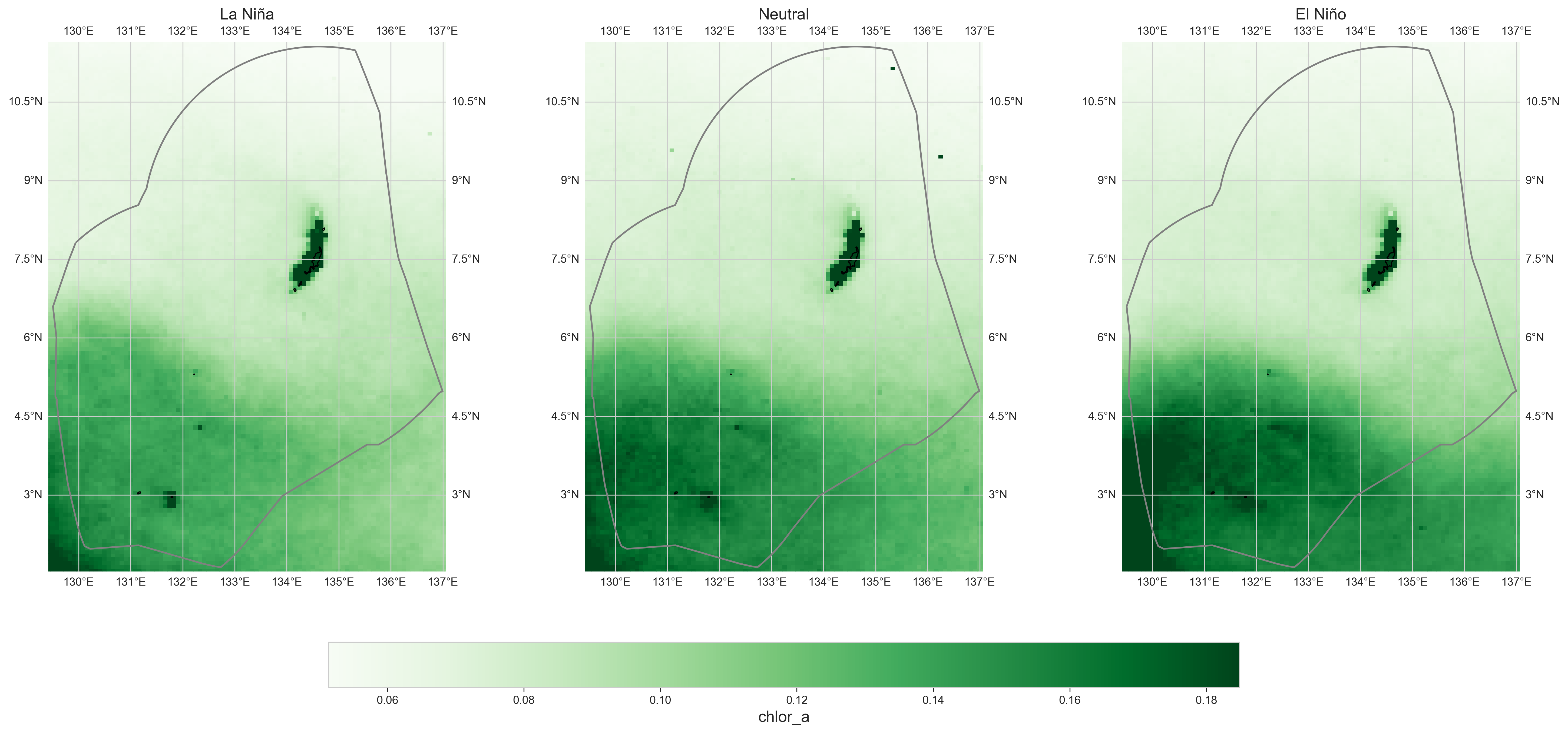
| 4.2 Analysis |
Figure 14 Chlorophyll ENSO state.
|
|
||
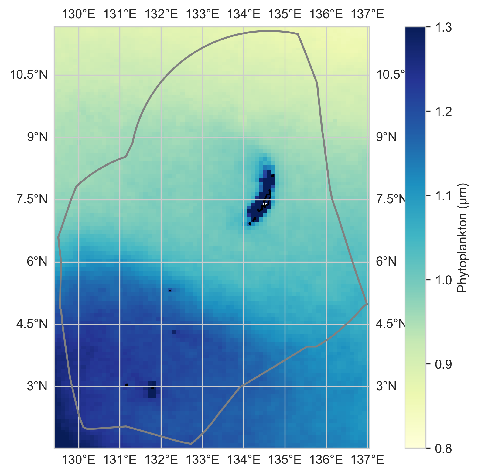
| 5. Estimated Phytoplankton Size | 5.1 Phytoplankton Trends |
Figure 14 pH
Figure 14 pH trends
|
|
|
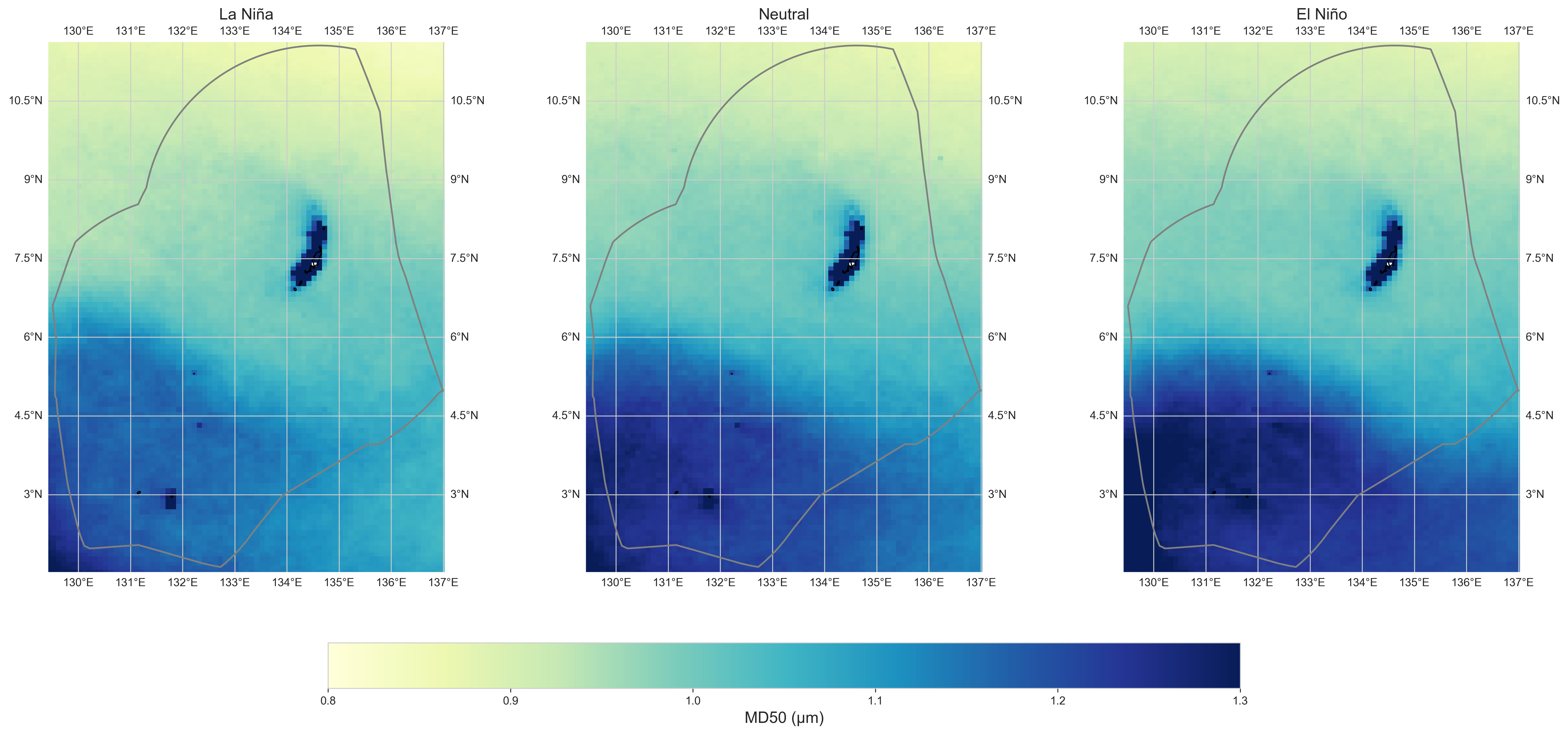
| 5.2 ENSO Analysis |
Figure 14 Chlorophyll ENSO state.
|
|
||
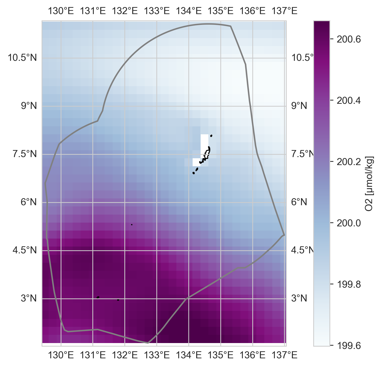
| 6. Subsurface Oxygen: O2 | 6.1 O2 Trends |
Figure 17 O2
Figure 17 O2 trends
|
|
|
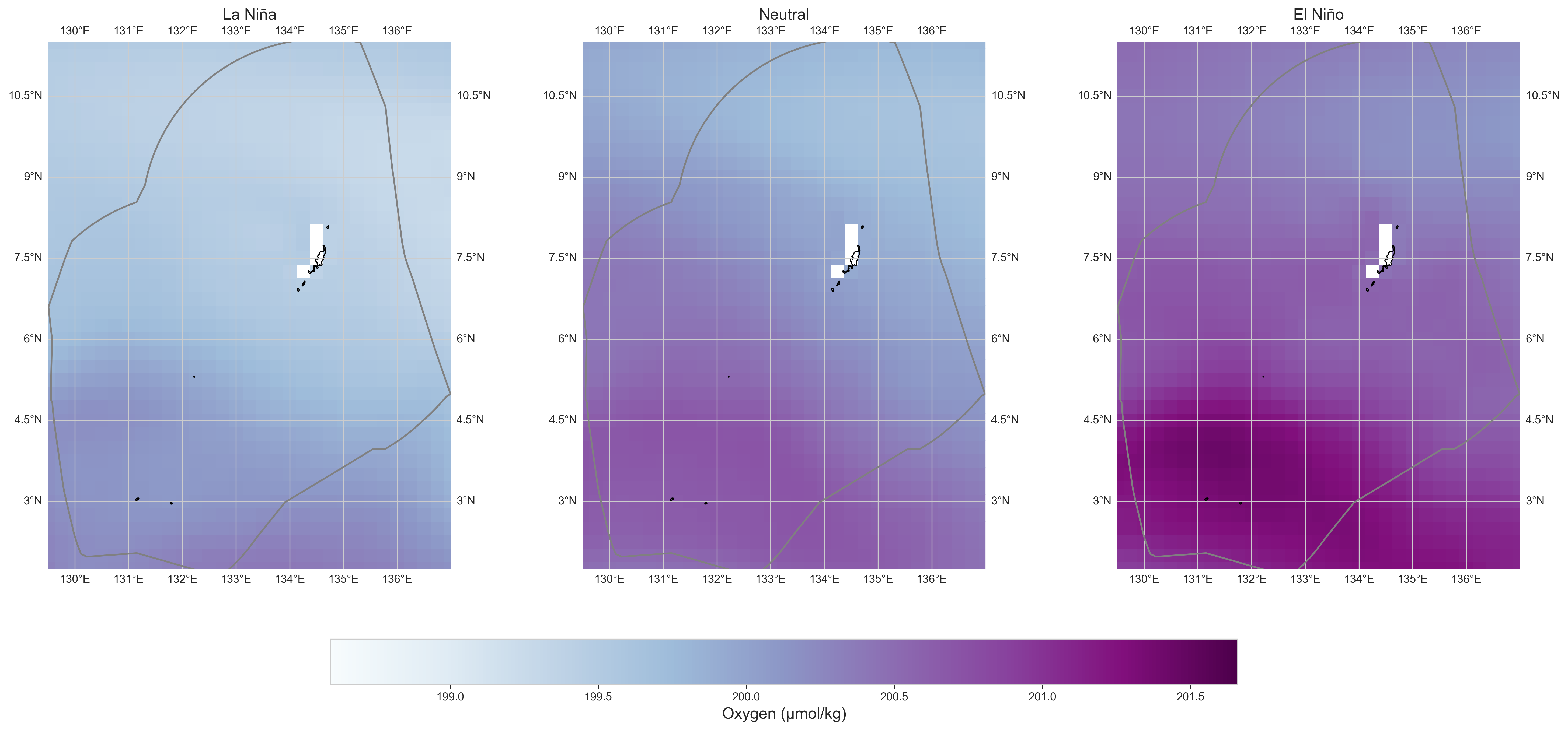
| 6.2 ENSO Analysis |
Figure 14 O2 ENSO state.
|
|