Local Maximum and Minimum Surface Temperature#
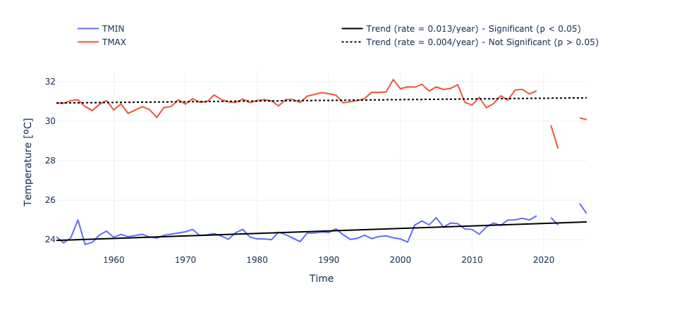
Figure. Annual maximum (red) and minimum (blue) temperature at Koror. The solid black line represents a trend that is statistically significant (p < 0.05). The dashed black line represents a trend that is not statistically significant.
Setup#
First, we need to import all the necessary libraries. Some of them are specifically developed to handle the download and plotting of the data and are hosted at the indicators set-up repository in GitHub
Show code cell source
import warnings
warnings.filterwarnings("ignore")
Show code cell source
import os.path as op
import sys
import contextlib
import numpy as np
import pandas as pd
import matplotlib.pyplot as plt
from myst_nb import glue
sys.path.append("../../../../indicators_setup")
from ind_setup.plotting_int import plot_timeseries_interactive, fig_int_to_glue
sys.path.append("../../../functions")
from data_downloaders import GHCN, filter_by_time_completeness
Define location and variables of interest#
country = 'Palau'
vars_interest = ['TMIN', 'TMAX']
Get Data#
update_data = False
path_data = "../../../data"
path_figs = "../../../matrix_cc/figures"
Observations from Koror Station#
https://www.ncei.noaa.gov/data/global-historical-climatology-network-daily/doc/GHCND_documentation.pdf
The data used for this analysis comes from the GHCN (Global Historical Climatology Network)-Daily database.
This a database that addresses the critical need for historical daily temperature, precipitation, and snow records over global land areas. GHCN-Daily is a
composite of climate records from numerous sources that were merged and then subjected to a suite of
quality assurance reviews. The archive includes over 40 meteorological elements including temperature daily maximum/minimum, temperature at observation time,
precipitation and more.
Show code cell source
if update_data:
df_country = GHCN.get_country_code(country)
print(f'The GHCN code for {country} is {df_country["Code"].values[0]}')
df_stations = GHCN.download_stations_info()
df_country_stations = df_stations[df_stations['ID'].str.startswith(df_country.Code.values[0])]
print(f'There are {df_country_stations.shape[0]} stations in {country}')
Show code cell source
if update_data:
GHCND_dir = 'https://www.ncei.noaa.gov/data/global-historical-climatology-network-daily/access/'
id = 'PSW00040309' # Koror Station
dict_min = GHCN.extract_dict_data_var(GHCND_dir, 'TMIN', df_country_stations.loc[df_country_stations['ID'] == id])[0][0]
dict_max = GHCN.extract_dict_data_var(GHCND_dir, 'TMAX', df_country_stations.loc[df_country_stations['ID'] == id])[0][0]
st_data = pd.concat([dict_min['data'], (dict_max['data'])], axis=1).dropna()
st_data['diff'] = st_data['TMAX'] - st_data['TMIN']
st_data['TMEAN'] = (st_data['TMAX'] + st_data['TMIN'])/2
st_data.to_pickle(op.join(path_data, 'GHCN_surface_temperature.pkl'))
else:
st_data = pd.read_pickle(op.join(path_data, 'GHCN_surface_temperature.pkl'))
# Inclusion criteria: remove months/years with less than 75% of data
df_filt, removed_months, removed_years = filter_by_time_completeness(
st_data,
month_threshold=0.75,
year_threshold=0.75
)
print(f"Removed {removed_months.shape[0]} months due to insufficient data: {removed_months.index.tolist()}")
print(f"Removed {removed_years.shape[0]} years due to insufficient data: {removed_years.index.tolist()}")
st_data = df_filt #replace data with filtered data
st_data_daily = st_data.loc[st_data.TMEAN < 50].copy()
Removed 14 months due to insufficient data: [(2018, 8), (2019, 1), (2020, 3), (2022, 7), (2022, 10), (2022, 11), (2022, 12), (2023, 1), (2023, 6), (2023, 8), (2023, 12), (2024, 2), (2025, 8), (2025, 10)]
Removed 3 years due to insufficient data: [2019, 2022, 2023]
print(st_data_daily.TMIN.mean(), st_data_daily.TMAX.mean())
24.383973736353393 31.058716344846346
dict_plot = [{'data' : st_data_daily, 'var' : 'TMAX', 'ax' : 1, 'label' : 'TMAX'}]
fig = plot_timeseries_interactive(dict_plot, trendline=True, figsize = (25, 12))
dict_plot = [{'data' : st_data_daily, 'var' : 'TMIN', 'ax' : 1, 'label' : 'TMIN'}]
fig = plot_timeseries_interactive(dict_plot, trendline=True, figsize = (25, 12))
st_data = st_data.resample('YE').mean()
glue("n_years", len(np.unique(st_data.index.year)), display=False)
glue("start_year", st_data.dropna().index[0].year, display=False)
glue("end_year", st_data.dropna().index[-1].year, display=False)
Plotting Annual#
At this piece of code we will plot the Mean annual temperature over time and its associated trend
The following plot represent the average minimum and maximum temperature over time
Minimum Temperatures#
dict_plot = [{'data' : st_data, 'var' : 'TMIN', 'ax' : 1, 'label' : 'TMIN'},
]
fig, trend_minimum = plot_timeseries_interactive(dict_plot, trendline=True, figsize = (24, 11), return_trend = True)
fig.write_html(op.join(path_figs, 'F3_ST_min.html'), include_plotlyjs="cdn")
Maximum Temperatures#
dict_plot = [{'data' : st_data, 'var' : 'TMAX', 'ax' : 1, 'label' : 'TMAX'},
]
fig, trend_maximum = plot_timeseries_interactive(dict_plot, trendline=True, figsize = (24, 11), return_trend = True)
fig.write_html(op.join(path_figs, 'F3_ST_max.html'), include_plotlyjs="cdn")
print(st_data.TMIN.mean(), st_data.TMAX.mean())
24.412562826647335 31.045708280937074
Minimum and Maximum Temperatures#
dict_plot = [{'data' : st_data, 'var' : 'TMIN', 'ax' : 1, 'label' : 'TMIN'},
{'data' : st_data, 'var' : 'TMAX', 'ax' : 1, 'label' : 'TMAX'},
# {'data' : st_data, 'var' : 'diff', 'ax' : 1, 'label' : 'Difference TMAX - TMIN'}
]
fig, TRENDS = plot_timeseries_interactive(dict_plot, label_yaxes = 'Temperature [ºC]', trendline=True, figsize = (24, 11), return_trend = True)
fig.write_html(op.join(path_figs, 'F3_ST_min_max.html'), include_plotlyjs="cdn")
glue("trend_min", float(TRENDS[0]), display=False)
glue("trend_max", float(TRENDS[1]), display=False)
glue("change_min", float(TRENDS[0]*len(np.unique(st_data.index.year))), display=False)
glue("change_max", float(TRENDS[1]*len(np.unique(st_data.index.year))), display=False)
glue("trend_fig_max_min", fig_int_to_glue(fig), display=False)
Fig. Annual maximum (red) and minimum (blue) temperature at Koror. The solid black line represents a trend that is statistically significant (p < 0.05). The dashed black line represents a trend that is not statistically significant.
Difference temperature#
The following plot represents the avergae difference between the minimum and maximum temperature over time. The decreasing trend means that the daily variability is decreasing over time
dict_plot = [{'data' : st_data, 'var' : 'diff', 'ax' : 1, 'label' : 'Difference TMAX - TMIN'}]
fig, trend = plot_timeseries_interactive(dict_plot, trendline=True, figsize = (25, 12), return_trend = True)
glue("trend_diff", float(trend[0]), display=False)
Fig. Annual maximum of the difference of the maximum and minimum temperature within each day
Generate table#
The final step is to generate a table sumarizing different metrics of the data analyzed in the plots above
from ind_setup.tables import table_temp_12, style_matrix
style_matrix(table_temp_12(st_data, st_data_daily, trend_maximum[0], trend_minimum[0]))
| Metric | Value |
|---|---|
| Annual Maximum Temperature (°C) | 32.104 |
| Change in Annual Maximum Temperature since 1951 | 0.296 |
| Rate of Change in Annual Maximum Temperature (°C/year) | 0.004 |
| Annual Minimum Temperature (°C) | 23.757 |
| Change in Annual Minimum Temperature since 1951 | 0.962 |
| Rate of Change in Annual Minimum Temperature (°C/year) | 0.013 |
| Mean Daily Mean Temperature (°C) | 27.721 |
| Mean Daily Maximum Temperature (°C) | 31.059 |
| Mean Daily Minimum Temperature (°C) | 24.384 |
0.013*(2025-1950)
0.975