Chlorophyll Concentration#
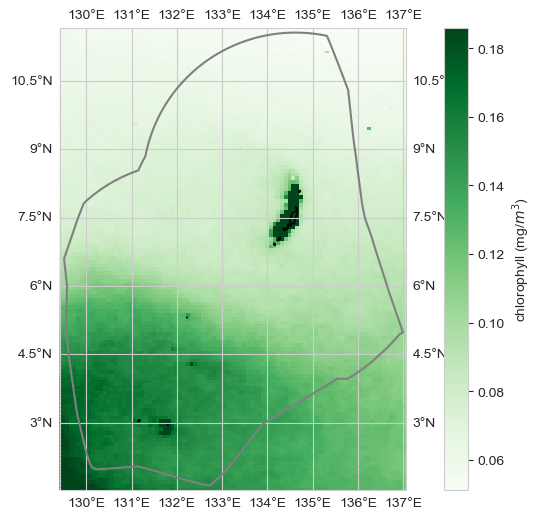
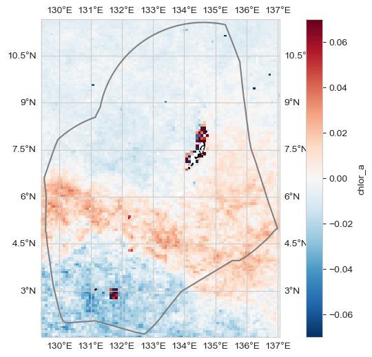
Figure. Change in Chlorophyll from satellite. The map (top) shows the change in annual mean Chlorophyll-a concentration (mg/m3) in the vicinity of Palau over the period 1998-2024 derived from satellite remotely sensed ocean color data. The grey line is the Palau EEZ. The line plot (bottom) shows the change in mean Chlorophyll-a concentration (mg/m3) averaged over the area within the top plot. The black line represents the trend, which is not statistically significant (p < 0.05).
Show code cell source
import warnings
warnings.filterwarnings("ignore")
import os
import os.path as op
import sys

import pandas as pd
import numpy as np
import xarray as xr
import geopandas as gpd
import cartopy.crs as ccrs
import matplotlib.pyplot as plt
from myst_nb import glue

sys.path.append("../../../../indicators_setup")

from ind_setup.plotting_int import plot_timeseries_interactive, plot_oni_index_th
from ind_setup.plotting import plot_base_map, plot_map_subplots, add_oni_cat, plot_bar_probs, fontsize

sys.path.append("../../../functions")
from data_downloaders import download_ERDDAP_data, download_oni_index
from ocean import process_trend_with_nan
Setup#
Define area of interest
#Area of interest
lon_range  = [129.4088, 137.0541]
lat_range = [1.5214, 11.6587]
EEZ shapefile
shp_f = op.join(os.getcwd(), '..', '..','..', 'data/Palau_EEZ/pw_eez_pol_april2022.shp')
shp_eez = gpd.read_file(shp_f)
Download Data#
update_data = False
path_data = "../../../data"
path_figs = "../../../matrix_cc/figures"
Show code cell source
base_url = 'https://oceanwatch.pifsc.noaa.gov/erddap/griddap/esa-cci-chla-monthly-v6-0.csv'
dataset_id = 'chlor_a'
if update_data:
    date_ini = '1998-01-01T00:00:00Z'
    date_end = '2024-12-01T00:00:00Z'
    data = download_ERDDAP_data(base_url, dataset_id, date_ini, date_end, lon_range, lat_range)
    data_xr = data.set_index(['latitude', 'longitude', 'time']).to_xarray()
    data_xr['time'] = pd.to_datetime(data_xr.time)
    data_xr = data_xr.coarsen(longitude=2, latitude=2, boundary = 'pad').mean()
    data_xr.to_netcdf(op.join(path_data, f'griddap_{dataset_id}.nc'))
else:
    data_xr = xr.open_dataset(op.join(path_data, f'griddap_{dataset_id}.nc'))
Analysis#
Average#
fig, ax = plot_base_map(shp_eez = shp_eez, figsize = [10, 6])
im = ax.pcolor(data_xr.longitude, data_xr.latitude, data_xr.mean(dim='time')[dataset_id], transform=ccrs.PlateCarree(),
                cmap = 'Greens', vmin = np.percentile(data_xr.mean(dim = 'time')[dataset_id], 1),
                vmax = np.percentile(data_xr.mean(dim = 'time')[dataset_id], 99))
ax.set_extent([lon_range[0], lon_range[1], lat_range[0], lat_range[1]], crs=ccrs.PlateCarree())
plt.colorbar(im, ax=ax, label='chlorophyll (mg/$m^3$)')
glue("average_map", fig, display=False)
plt.savefig(op.join(path_figs, 'F15_chlorophyll_mean_map.png'), dpi=300, bbox_inches='tight')
Change#
trend_m, _, _, _, _ = process_trend_with_nan(data_xr[dataset_id])

fig, ax = plot_base_map(shp_eez = shp_eez, figsize = [10, 6])
im = ax.pcolor(data_xr.longitude, data_xr.latitude,
               trend_m,
                transform=ccrs.PlateCarree(),
                cmap = 'RdBu_r',
                vmin = -.07,
                vmax = .07,
                )
ax.set_extent([lon_range[0], lon_range[1], lat_range[0], lat_range[1]], crs=ccrs.PlateCarree())
plt.colorbar(im, ax=ax, label=  dataset_id)
plt.savefig(op.join(path_figs, 'F15_chlorophyll_mean_map_trend.png'), dpi=300, bbox_inches='tight')
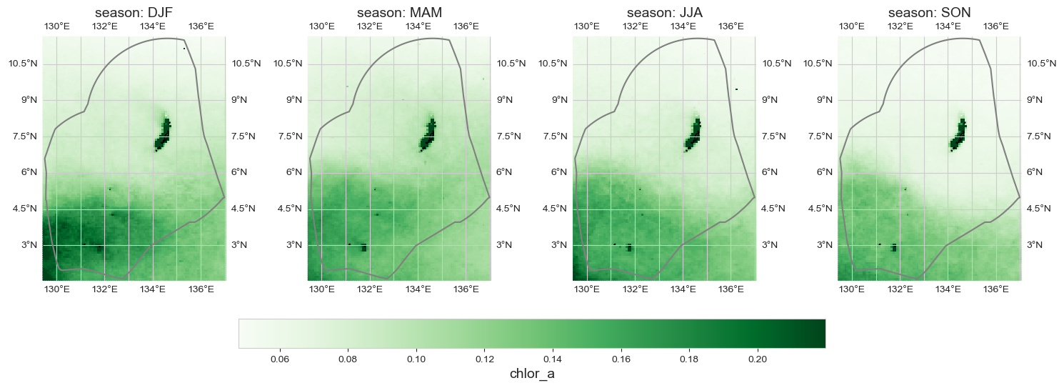
Seasonal average#
data_month = data_xr.groupby('time.season').mean().sel(season = ['DJF', 'MAM', 'JJA', 'SON'])
im = plot_map_subplots(data_month, dataset_id, shp_eez = shp_eez, cmap = 'Greens',
                  vmin = np.nanpercentile(data_month.min(dim = 'season')[dataset_id], 1),
                  vmax = np.nanpercentile(data_month.max(dim = 'season')[dataset_id], 99),
                  figsize = (15,11), sub_plot = [1, 4], cbar_pad = 0.05, cbar = 1)
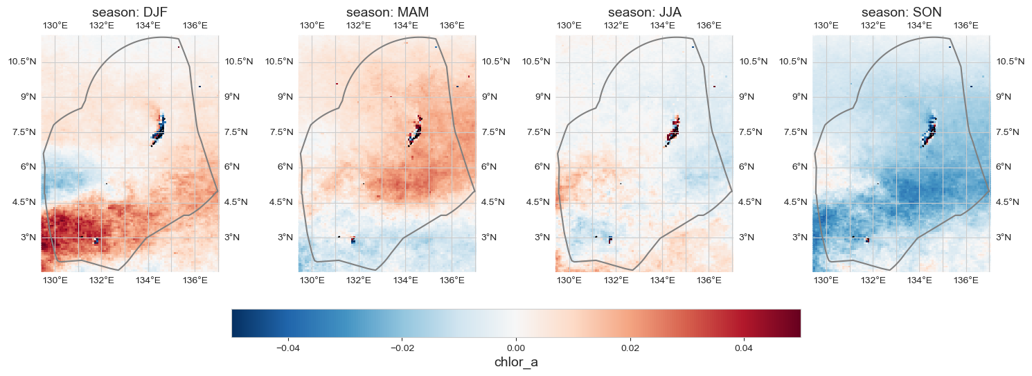
Seasonal anomaly#
data_month = data_xr.groupby('time.season').mean().sel(season = ['DJF', 'MAM', 'JJA', 'SON']) - data_xr.mean(dim='time')
im = plot_map_subplots(data_month, dataset_id, shp_eez = shp_eez,
                  cmap = 'RdBu_r', vmin=-.05, vmax=.05,
                  figsize = (15,11), sub_plot = [1, 4], cbar_pad = 0.05,
                  cbar = 1)
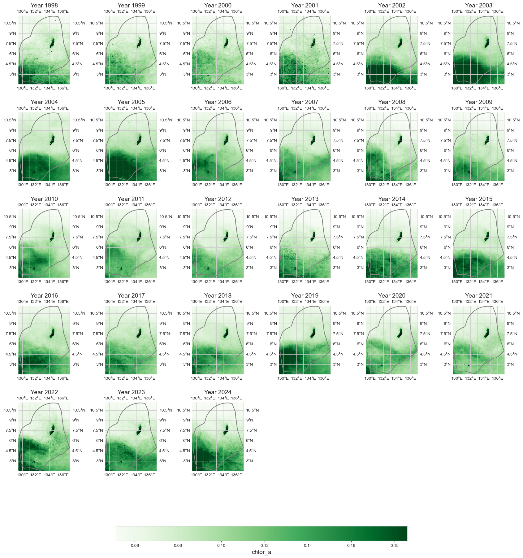
Annual average#
data_y = data_xr.resample(time='1YE').mean()
fig = plot_map_subplots(data_y, dataset_id, shp_eez = shp_eez, cmap = 'Greens', vmin = np.percentile(data_xr.mean(dim = 'time')[dataset_id], 1),
                vmax = np.percentile(data_xr.mean(dim = 'time')[dataset_id], 99), cbar = 1)
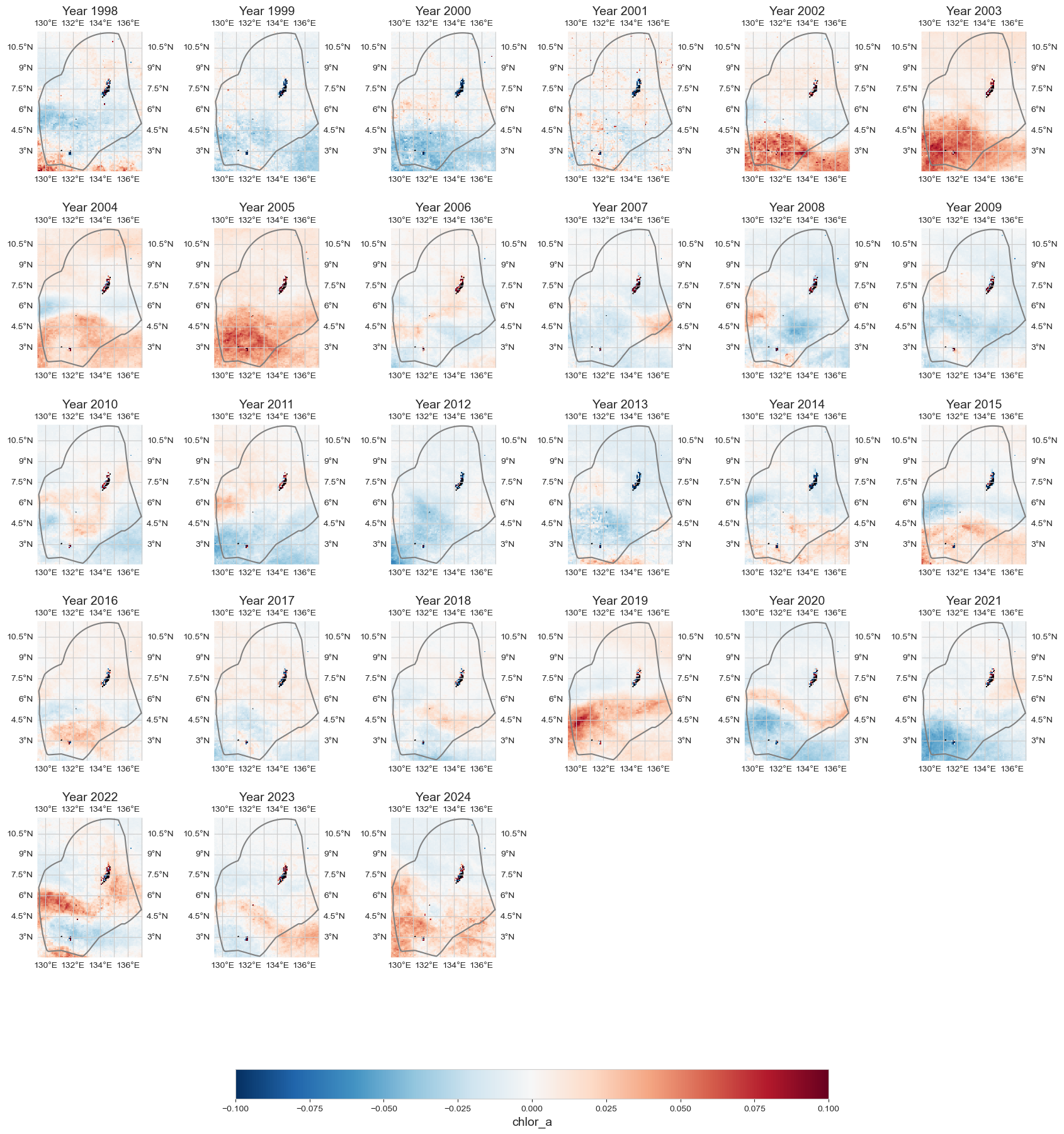
Annual anomaly#
data_an = data_y - data_xr.mean(dim='time')
fig = plot_map_subplots(data_an, dataset_id, shp_eez = shp_eez, cmap='RdBu_r', vmin=-.1, vmax=.1, cbar = 1)
Average over area#
dict_plot = [{'data' : data_xr.mean(dim = ['longitude', 'latitude']).to_dataframe(),
              'var' : dataset_id, 'ax' : 1, 'label' : 'Chlorophyll - MEAN AREA'},]
fig, trend = plot_timeseries_interactive(dict_plot, trendline=True, scatter_dict = None, return_trend=True, figsize = (25, 12), label_yaxes = 'Chlorophyll (mg/m3)');
fig.write_html(op.join(path_figs, 'F15_chlorophyll_mean_trend.html'), include_plotlyjs="cdn")
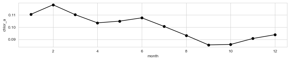
Seasonal variability#
fig, ax = plt.subplots(figsize=(12,2))
data_xr.mean(dim = ['longitude', 'latitude']).groupby('time.month').mean()[dataset_id].plot(ax = ax, marker = 'o', color = 'k')
[<matplotlib.lines.Line2D at 0x191310920>]
d_p = data_xr.mean(dim = ['longitude', 'latitude']).to_dataframe()
Timeseries at a given point#
loc = [7.37, 134.7]
dict_plot = [{'data' : data_xr.sel(longitude=loc[1], latitude=loc[0], method='nearest').to_dataframe(),
              'var' : dataset_id, 'ax' : 1, 'label' : f'Chlorophyll at [{loc[0]}, {loc[1]}]'},]
fig, ax = plot_base_map(shp_eez = shp_eez, figsize = [10, 6])
ax.set_extent([lon_range[0], lon_range[1], lat_range[0], lat_range[1]], crs=ccrs.PlateCarree())
ax.plot(loc[1], loc[0], '*', markersize = 12, color = 'royalblue', transform=ccrs.PlateCarree(), label = 'Location Analysis')
ax.legend()
<matplotlib.legend.Legend at 0x1913719a0>
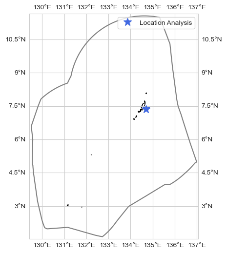
fig = plot_timeseries_interactive(dict_plot, trendline=True, scatter_dict = None, figsize = (25, 12), label_yaxes = 'Chlorophyll (mg/m3)');
ONI index analysis#
p_data = 'https://psl.noaa.gov/data/correlation/oni.data'
df1 = download_oni_index(p_data)
lims = [-.5, .5]
plot_oni_index_th(df1, lims = lims)
df1 = add_oni_cat(df1, lims = lims)
df1['ONI'] = df1['oni_cat']
data_xr['ONI'] = (('time'), df1.iloc[np.intersect1d(data_xr.time, df1.index, return_indices=True)[2]].ONI.values)
data_xr['ONI_cat'] = (('time'), np.where(data_xr.ONI < lims[0], -1, np.where(data_xr.ONI > lims[1], 1, 0)))
data_oni = data_xr.groupby('ONI_cat').mean()
Average#
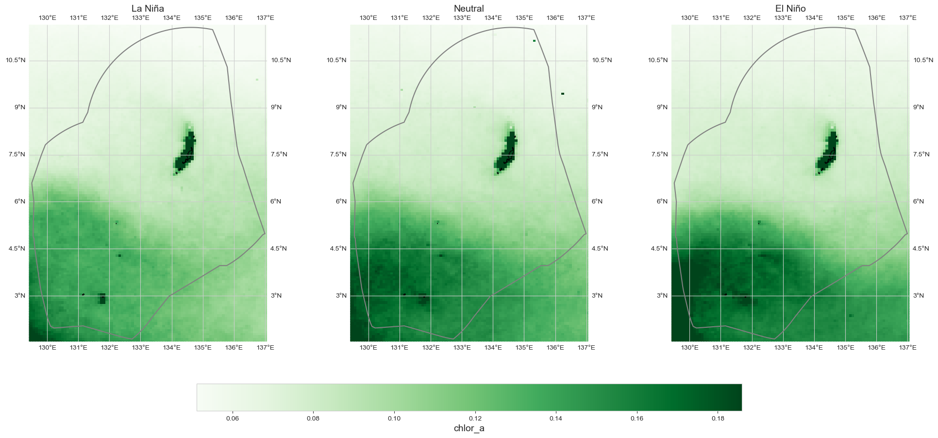
fig = plot_map_subplots(data_oni, dataset_id, shp_eez = shp_eez, cmap = 'Greens',
                  vmin = np.percentile(data_xr.mean(dim = 'time')[dataset_id], 1),
                  vmax = np.percentile(data_xr.mean(dim = 'time')[dataset_id], 99),
                  sub_plot= [1, 3], figsize = (20, 9),  cbar = True, cbar_pad = 0.1,
                  titles = ['La Niña', 'Neutral', 'El Niño'],)
plt.savefig(op.join(path_figs, 'F15_chlorophyll_ENSO.png'), dpi=300, bbox_inches='tight')
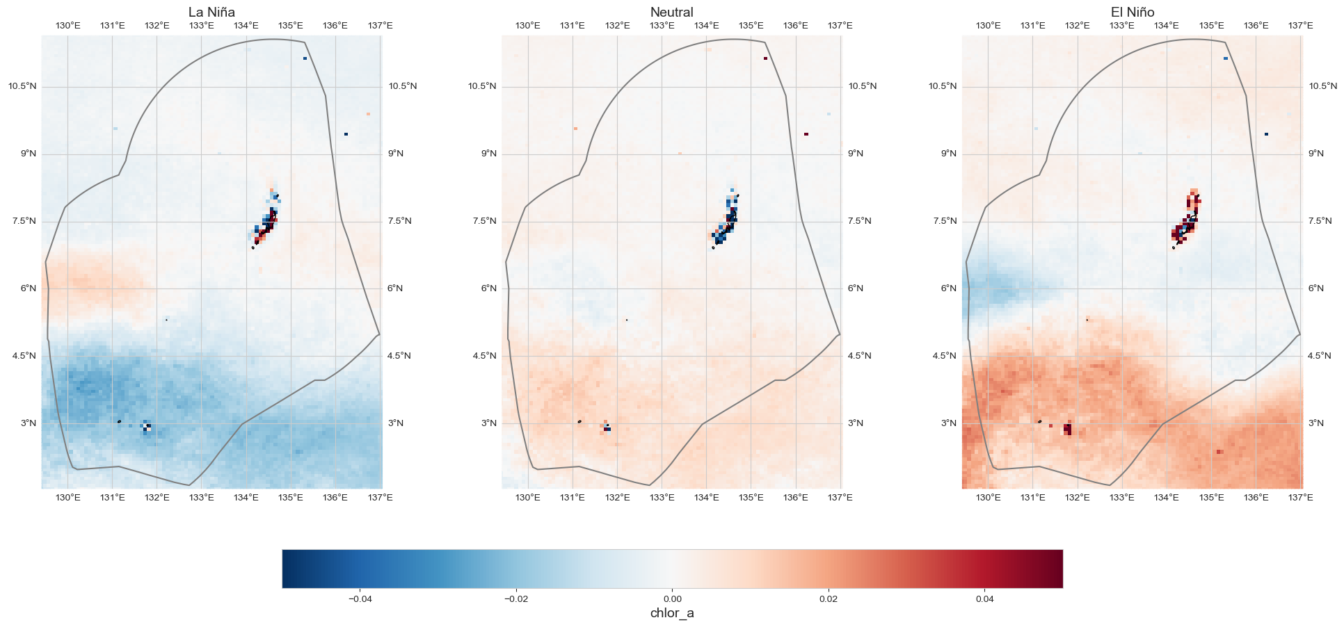
Anomaly#
data_an = data_oni - data_xr.mean(dim='time')
fig = plot_map_subplots(data_an, dataset_id, shp_eez = shp_eez, cmap='RdBu_r', vmin=-.05, vmax=.05,
                  sub_plot= [1, 3], figsize = (20, 9),  cbar = True, cbar_pad = 0.1,
                  titles = ['La Niña', 'Neutral', 'El Niño'],)
Table#
from ind_setup.tables import style_matrix, table_ocean
style_matrix(table_ocean(data_xr, trend[0], data_oni, dataset_id))
| Metric | Value |
|---|---|
| Monthly Average | 0.100 |
| Monthly Maximum 01/02/2005 | 0.166 |
| Monthly Minimum 01/09/1998 | 0.052 |
| Maximum Annual Average | 0.121 |
| Minimum Annual Average | 0.089 |
| Rate of change [mg/m3/year] | -0.000 |
| Change between 1998 and 2024 [mg/m3] | -0.000 |
| Average La Niña chlor_a | 0.096 |
| Average El Niño chlor_a | 0.106 |
| Average Neutral chlor_a | 0.103 |